Context Menus
GoDiagram provides a mechanism for you to define context menus for any object or for the diagram background.
Note: GoDiagram context menus cannot render outside of Diagrams, because they are objects inside the Diagram and therefore drawn only on the Diagram.
A GoDiagram context menu is an Adornment that is shown when the user context-clicks (right mouse click or long touch hold) an object that has its GraphObject.ContextMenu set. The context menu is bound to the same data as the part itself.
See samples that make use of context menus in the samples index.
It is typical to implement a context menu as a "ContextMenu" Panel containing "ContextMenuButton"s,
as you can see in the code below in the assignment of the Node's GraphObject.ContextMenu and Diagram.ContextMenu properties.
Each "ContextMenu" is just a "Vertical" Panel Adornment that is shadowed.
Each "ContextMenuButton" is a Panel on which you can set the GraphObject.Click event handler.
In the event handler obj.Part will be the whole context menu Adornment.
obj.Part.AdornedPart will be the adorned Node or Link.
The bound data is obj.Part.Data, which will be the same as obj.Part.AdornedPart.Data.
You can see how the "ContextMenu" and "ContextMenuButton" builders are defined at Buttons.cs. There are examples of customizing buttons at Introduction to Buttons.
In this example each Node has its GraphObject.ContextMenu property set to an Adornment that shows a single button that when clicked changes the color property of the bound model data. The diagram gets its own context menu by setting Diagram.ContextMenu.
  // This method is called as a context menu button's click handler.
  // Rotate the selected node's color through a predefined sequence of colors.
  var changeColor = new Action<InputEvent, GraphObject>((e, obj) => {
    e.Diagram.Commit(d => {
      // get the context menu that holds the button that was clicked
      var contextmenu = obj.Part;
      // get the node data to which the Node is data bound
      var nodedata = contextmenu.Data as NodeData;
      // compute the next color for the node
      var newcolor = "lightblue";
      switch (nodedata.Color) {
        case "lightblue": newcolor = "lightgreen"; break;
        case "lightgreen": newcolor = "lightyellow"; break;
        case "lightyellow": newcolor = "orange"; break;
        case "orange": newcolor = "lightblue"; break;
      }
      // modify the node data
      // this evaluates data Bindings and records changes in the UndoManager
      d.Model.Set(nodedata, "Color", newcolor);
    }, "changed color");
  });

  // this is a normal Node template that also has a context menu defined for it
  diagram.NodeTemplate =
    new Node("Auto") {
        ContextMenu =  // define a context menu for each node that has one button
          Builder.Make<Adornment>("ContextMenu")
            .Add(
              Builder.Make<Panel>("ContextMenuButton")
                .Set(new {
                  ButtonBorder_Fill = "white",
                  _ButtonFillOver = "skyblue",
                  Click = changeColor
                })
                .Add(new TextBlock("Change Color"))
            )  // end of Adornment
      }
      .Add(
        new Shape("RoundedRectangle") { Fill = "white" }
          .Bind("Fill", "Color"),
        new TextBlock { Margin = 5 }
          .Bind("Text", "Key")
      );

  // also define a context menu for the diagram's background
  diagram.ContextMenu =
    Builder.Make<Adornment>("ContextMenu")
      .Add(
        Builder.Make<Panel>("ContextMenuButton")
          .Set(new {
            Click = new Action<InputEvent, GraphObject>((e, obj) => {
              e.Diagram.CommandHandler.Undo();
            })
          })
          .Add(new TextBlock("Undo"))
          .Bind(new Binding("Visible", "", o => {
            return (o as Panel).Diagram?.CommandHandler.CanUndo();
          }).OfElement()),
        Builder.Make<Panel>("ContextMenuButton")
          .Set(new {
            Click = new Action<InputEvent, GraphObject>((e, obj) => {
              e.Diagram.CommandHandler.Redo();
            })
          })
          .Add(new TextBlock("Redo"))
          .Bind(new Binding("Visible", "", o => {
            return (o as Panel).Diagram?.CommandHandler.CanRedo();
          }).OfElement()),
        // no binding, always visible button:
        Builder.Make<Panel>("ContextMenuButton")
          .Set(new {
            Click = new Action<InputEvent, GraphObject>((e, obj) => {
              e.Diagram.Commit(d => {
                var data = new NodeData();
                d.Model.AddNodeData(data);
                var part = d.FindPartForData(data);  // must be same data reference
                // set location to saved mouseDownPoint in ContextMenuTool
                part.Location = d.ToolManager.ContextMenuTool.MouseDownPoint;
              }, "new node");
            })
          })
          .Add(new TextBlock("New Node"))
      );

  diagram.Model =
    new MyModel {
      NodeDataSource = new List<NodeData> {
        new NodeData { Key = "Alpha", Color = "lightyellow" },
        new NodeData { Key = "Beta", Color = "orange" }
      },
      LinkDataSource = new List<LinkData> {
        new LinkData { From = "Alpha", To = "Beta" }
      }
    };
  diagram.UndoManager.IsEnabled = true;

Context clicking a node and invoking the "Change Color" command changes the node's color. With the diagram context menu you will be able to "Undo" and/or "Redo", or you can use Control-Z and/or Control-Y.
Positioning
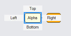
There are two ways to customize the positioning of the context menu relative to the adorned GraphObject. One way is to override ContextMenuTool.PositionContextMenu. Another way is to have the context menu Adornment include a Placeholder. The Placeholder is positioned to have the same size and position as the adorned object. The context menu will not to have a background, and thus will not display a shadow by default when using a Placeholder.
  // this is a shared context menu button click event handler, just for demonstration
  var cmCommand = new Action<InputEvent, GraphObject>((e, obj) => {
    var node = (obj.Part as Adornment).AdornedPart;
    var buttontext = (obj as Panel).Elt(1) as TextBlock;  // the TextBlock
    Console.WriteLine(buttontext.Text + " command on" + (node.Data as NodeData).Key);
  });

  // this is a normal Node template that also has a context menu defined for it
  diagram.NodeTemplate =
    new Node("Auto") {
        // define a context menu for each node that has several buttons around a Placeholder
        ContextMenu =
          new Adornment("Spot")
            .Add(
              new Placeholder { Padding = 5 },
              Builder.Make<Panel>("ContextMenuButton")
                .Set(new {
                  Alignment = Spot.Top, AlignmentFocus = Spot.Bottom,
                  Click = cmCommand
                })
                .Add(new TextBlock("Top")),
              Builder.Make<Panel>("ContextMenuButton")
                .Set(new {
                  Alignment = Spot.Right, AlignmentFocus = Spot.Left,
                  Click = cmCommand
                })
                .Add(new TextBlock("Right")),
              Builder.Make<Panel>("ContextMenuButton")
                .Set(new {
                  Alignment = Spot.Bottom, AlignmentFocus = Spot.Top,
                  Click = cmCommand
                })
                .Add(new TextBlock("Bottom")),
              Builder.Make<Panel>("ContextMenuButton")
                .Set(new {
                  Alignment = Spot.Left, AlignmentFocus = Spot.Right,
                  Click = cmCommand
                })
                .Add(new TextBlock("Left"))
            )  // end Adornment
      }
      .Add(
        new Shape("RoundedRectangle") { Fill = "white" }
          .Bind("Fill", "Color"),
        new TextBlock { Margin = 5 }
          .Bind("Text", "Key")
      );

  diagram.Model =
    new MyModel {
      NodeDataSource = new List<NodeData> {
        new NodeData { Key = "Alpha", Color = "lightyellow" },
        new NodeData { Key = "Beta", Color = "orange" }
      },
      LinkDataSource = new List<LinkData> {
        new LinkData { From = "Alpha", To = "Beta" }
      }
    };
