ToolTips
GoDiagram provides a way to create customized tooltips for any object or for the diagram background.
A tooltip is an Adornment that is shown when the mouse hovers over an object that has its GraphObject.ToolTip set. The tooltip part is bound to the same data as the part itself.
See samples that make use of tooltips in the samples index.
It is typical to implement a tooltip as a "ToolTip" Panel holding a TextBlock or a Panel of TextBlocks and other objects. Each "ToolTip" is just an "Auto" Panel Adornment that is shadowed, and where the border is a rectangular Shape with a light gray fill. However you can implement the tooltip as any arbitrarily complicated Adornment.
You can see how the "ToolTip" builder is defined at Buttons.cs.
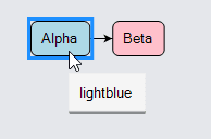
In this example each Node has its GraphObject.ToolTip property set to a Part that shows the Data.Color property via a normal data binding. The diagram gets its own tooltip by setting Diagram.ToolTip.
  diagram.NodeTemplate =
    new Node("Auto") {
        ToolTip =  // define a tooltip for each node that displays the color as text
          Builder.Make<Adornment>("ToolTip")
            .Add(
              new TextBlock { Margin = 4 }
                .Bind("Text", "Color")
            )  // end of Adornment
      }
      .Add(
        new Shape("RoundedRectangle") { Fill = "white" }
          .Bind("Fill", "Color"),
        new TextBlock { Margin = 5 }
          .Bind("Text", "Key")
      );

  // a function that produces the content of the diagram tooltip
  static string DiagramInfo(object m) {
    var model = m as MyModel;
    return "Model:\n" + model.NodeDataSource.Count() + " nodes, " +
                        model.LinkDataSource.Count() + " links";
  }

  // provide a tooltip for the background of the Diagram, when not over any Part
  diagram.ToolTip =
    Builder.Make<Adornment>("ToolTip")
      .Add(
        new TextBlock { Margin = 4 }.Bind("Text", "", DiagramInfo)
      );

  diagram.Model =
    new MyModel {
      NodeDataSource = new List<NodeData> {
        new NodeData { Key = "Alpha", Color = "lightblue" },
        new NodeData { Key = "Beta", Color = "pink" }
      },
      LinkDataSource = new List<LinkData> {
        new LinkData { From = "Alpha", To = "Beta" }
      }
    };

Pausing the mouse over each of the nodes or in the background of the diagram displays the tooltip. If you copy some parts, you will see that the tooltip for the diagram displays newer information about the diagram.
You can change how long for the mouse has to wait motionless before a tooltip appears by setting ToolManager.HoverDelay.
For example, diagram.ToolManager.HoverDelay = 600; changes the delay to be 6/10ths of one second.
You can change how long the tooltip remains visible by setting ToolManager.ToolTipDuration.
For example, diagram.ToolManager.ToolTipDuration = 10000; changes the visible time to 10 seconds.
Positioning
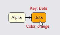
There are two ways to customize the positioning of the tooltip relative to the adorned GraphObject. One way is to override ToolManager.PositionToolTip. Another way is to have the tooltip Adornment include a Placeholder. The Placeholder is positioned to have the same size and position as the adorned object. When creating tooltips with Placeholders, don't use the predefined "ToolTip" builder as it will introduce an extra shape typically used as the border for the "Auto" Panel.
  // this is a normal Node template that also has a tooltip defined for it
  diagram.NodeTemplate =
    new Node("Auto") {
        ToolTip =  // define a tooltip for each node that has several labels around it
          new Adornment("Spot") {
              Background = "transparent"  // avoid hiding tooltip when mouse moves
            }
            .Add(
              new Placeholder { Padding = 5 },
              new TextBlock {
                  Alignment = Spot.Top, AlignmentFocus = Spot.Bottom, Stroke = "red"
                }
                .Bind("Text", "Key", s => "Key: " + s),
              new TextBlock {
                  Alignment = Spot.Bottom, AlignmentFocus = Spot.Top, Stroke = "red"
                }
                .Bind("Text", "Color", s => "Color: " + s)
            )  // end Adornment
      }
      .Add(
        new Shape("RoundedRectangle") { Fill = "white" }
          .Bind("Fill", "Color"),
        new TextBlock { Margin = 5 }
          .Bind("Text", "Key")
      );

  diagram.Model =
    new MyModel {
      NodeDataSource = new List<NodeData> {
        new NodeData { Key = "Alpha", Color = "lightyellow" },
        new NodeData { Key = "Beta", Color = "orange" }
      },
      LinkDataSource = new List<LinkData> {
        new LinkData { From = "Alpha", To = "Beta" }
      }
    };

Note how the Adornment implementing the tooltip uses a "transparent" background so that the tooltip is not automatically removed when the mouse moves.