Nodes
You can customize your nodes to have exactly the appearance and behavior that you want. So far you have only seen very simple nodes. But if you have seen the Sample Applications, you have seen many other kinds of nodes.
In this page we demonstrate some of the choices you can make when designing your nodes.
Surrounding Content
It is common to surround interesting information with a border or other background.
Simple borders
Many of the simplest nodes just consist of a Panel of type PanelLayoutAuto with a Shape surrounding a TextBlock.
  diagram.NodeTemplate =
    new Node("Auto")
      .Add(
        new Shape()
          .Bind("Fill", "Color"),
        new TextBlock { Margin = 5 }
          .Bind("Text", "Key")
      );

  diagram.Model =
    new MyModel {
      NodeDataSource = new List<NodeData> {
        new NodeData { Key = "Alpha", Color = "lightblue" }
      }
    };

Shaped nodes
The Shape surrounding the content need not be rectangular. This example demonstrates a number of shapes.
  diagram.NodeTemplate =
    new Node("Auto")
      .Add(
        new Shape()
          .Bind("Figure", "Fig")
          .Bind("Fill", "Color"),
        new TextBlock { Margin = 5 }
          .Bind("Text", "Key")
      );

  diagram.Model =
    new MyModel {
      NodeDataSource = new List<NodeData> {
        new NodeData { Key = "Alpha", Color = "lightblue", Fig = "RoundedRectangle" },
        new NodeData { Key = "Beta", Color = "lightblue", Fig = "Ellipse" },
        new NodeData { Key = "Gamma", Color = "lightblue", Fig = "Hexagon" },
        new NodeData { Key = "Delta", Color = "lightblue", Fig = "FramedRectangle" },
        new NodeData { Key = "Epsilon", Color = "lightblue", Fig = "Cloud" },
        new NodeData { Key = "Zeta", Color = "lightblue", Fig = "Procedure" }
      }
    };
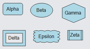
The surrounding/background object need not be a Shape. You could use a Picture or even a more complex object such as a Panel.
Complex contents
The content of an Auto Panel need not be limited to a single TextBlock -- you can have arbitrarily complex panels of objects. In this example the content is a Table Panel with three rows of TextBlocks.
  diagram.NodeTemplate =
    new Node("Auto")
      .Add(
        new Shape {
            Fill = new Brush(new LinearGradientPaint(new[] { (0f, "white"), (1f, "lightblue") })),
            Stroke = "darkblue", StrokeWidth = 2
          },
        new Panel("Table") { DefaultAlignment = Spot.Left, Margin = 4 }
          .Add(
            new ColumnDefinition { Column = 1, Width = 4 }
          )
          .Add(
            new TextBlock {
                Row = 0, Column = 0, ColumnSpan = 3, Alignment = Spot.Center,
                Font = new Font("Segoe UI", 16, FontWeight.Bold)
              }
              .Bind("Text", "Key"),
            new TextBlock("First: ") { Row = 1, Column = 0 },
            new TextBlock { Row = 1, Column = 2 }
              .Bind("Text", "Prop1"),
            new TextBlock("Second: ") { Row = 2, Column = 0 },
            new TextBlock { Row = 2, Column = 2 }
              .Bind("Text", "Prop2")
          )
      );

  diagram.Model =
    new MyModel {
      NodeDataSource = new List<NodeData> {
        new NodeData { Key = "Alpha", Prop1 = "value of 'Prop1'", Prop2 = "the other property" }
      }
    };

Fixed-size nodes
The above examples have the "Auto" Panel surround some content, where the content might be of different sizes. That results in the Nodes having different sizes.
If you want a Panel (and thus a Node, because Node inherits from Part which inherits from Panel) to be of fixed size, set GraphObject.DesiredSize on that panel. (Equivalently, you can set GraphObject.Width and GraphObject.Height.) That may result in the clipping of content that is too large, or it may result in extra space if the content is smaller than the available area provided by the "Auto" Panel.
  diagram.NodeTemplate =
    new Node("Auto") { DesiredSize = new Size(100, 50) }  // on Panel
      .Add(
        new Shape()
          .Bind("Figure", "Fig")
          .Bind("Fill", "Color"),
        new TextBlock { Margin = 5 }
          .Bind("Text", "Key")
      );

  diagram.Model =
    new MyModel {
      NodeDataSource = new List<NodeData> {
        new NodeData { Key = "Alpha", Color = "lightblue", Fig = "RoundedRectangle" },
        new NodeData { Key = "Beta", Color = "lightblue", Fig = "Ellipse" },
        new NodeData { Key = "Gamma", Color = "lightblue", Fig = "Hexagon" },
        new NodeData { Key = "Delta", Color = "lightblue", Fig = "FramedRectangle" },
        new NodeData { Key = "Epsilon,Epsilon,Epsilon", Color = "lightblue", Fig = "Cloud" },
        new NodeData { Key = "Zeta", Color = "lightblue", Fig = "Procedure" }
      }
    };

Note how the "Epsilon..." TextBlock is measured with the constraint of having a limited width, as imposed by the Panel's width. That results in the text being wrapped before (maybe) being clipped.
You probably do not want to set the DesiredSize of the main element, the Shape in this case above. If you did, that would not constrain how the content elements are sized within the Panel.
  diagram.NodeTemplate =
    new Node("Auto")
      .Add(
        new Shape { DesiredSize = new Size(100, 50) }  // on main element, not on Panel
          .Bind("Figure", "Fig")
          .Bind("Fill", "Color"),
        new TextBlock { Margin = 5 }
          .Bind("Text", "Key")
      );

  diagram.Model =
    new MyModel {
      NodeDataSource = new List<NodeData> {
        new NodeData { Key = "Alpha", Color = "lightblue", Fig = "RoundedRectangle" },
        new NodeData { Key = "Beta", Color = "lightblue", Fig = "Ellipse" },
        new NodeData { Key = "Gamma", Color = "lightblue", Fig = "Hexagon" },
        new NodeData { Key = "Delta", Color = "lightblue", Fig = "FramedRectangle" },
        new NodeData { Key = "Epsilon,Epsilon,Epsilon", Color = "lightblue", Fig = "Cloud" },
        new NodeData { Key = "Zeta", Color = "lightblue", Fig = "Procedure" }
      }
    };
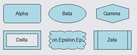
Note how the TextBlock is measured without the constraint of having a limited width from the Panel. That results in the text being treated as a single long line, which is then clipped by the Panel.
Stacked Content
Many simple nodes consist of a few objects positioned above each other or next to each other.
Icons
Perhaps the most commonly seen kind of node can be implemented using a Vertical Panel.
  diagram.NodeTemplate =
    new Node("Vertical")
      .Add(
        new Picture { MaxSize = new Size(50, 50) }
          .Bind("Source", "Img"),
        new TextBlock {
            Margin = new Margin(3, 0, 0, 0),
            MaxSize = new Size(100, 30),
            IsMultiline = false
          }
          .Bind("Text")
      );

  diagram.Model =
    new MyModel {
      NodeDataSource = new List<NodeData> {
        new NodeData { Text = "Jellylorum", Img = "images/50x40.png" }
      }
    };
Of course you are not limited to just two objects in a panel. In fact you can have as many GraphObjects in a "Vertical" or a "Horizontal" Panel as you like.
  diagram.NodeTemplate =
    new Node("Vertical")
      .Add(
        new TextBlock {
            Margin = new Margin(3, 0, 0, 0),
            MaxSize = new Size(100, 30),
            IsMultiline = false,
            Font = new Font("Segoe UI", 15, FontWeight.Bold)
          }
          .Bind("Text", "Head"),
        new Picture { MaxSize = new Size(50, 50) }
          .Bind("Source", "Img"),
        new TextBlock {
            Margin = new Margin(3, 0, 0, 0),
            MaxSize = new Size(100, 30),
            IsMultiline = false
          }
          .Bind("Text", "Foot")
      );

  diagram.Model =
    new MyModel {
      NodeDataSource = new List<NodeData> {
        new NodeData { Head = "Kitten", Foot = "Tantomile", Img = "images/50x40.png" }
      }
    };
Small icons
Another commonly seen kind of node can be implemented using a Horizontal Panel.
  diagram.NodeTemplate =
    new Node("Horizontal")
      .Add(
        new Picture { MaxSize = new Size(16, 16) }
          .Bind("Source", "Img"),
        new TextBlock { Margin = new Margin(0, 0, 0, 2) }
          .Bind("Text")
      );

  diagram.Model =
    new MyModel {
      NodeDataSource = new List<NodeData> {
        new NodeData { Text = "Alonzo", Img = "images/50x40.png" }
      }
    };
Nested Panels
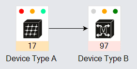
Panels can be nested. For example, here is a node consisting of a "Vertical" Panel consisting of an "Auto" Panel surrounding a "Vertical" Panel including a "Horizontal" Panel. The outer "Vertical" Panel arranges the main stuff on top and a TextBlock on the bottom. The "Auto" Panel supplies a border around everything but the bottom text. The inner "Vertical" Panel places three objects vertically in a stack. The "Horizontal" Panel which is the first element of the "Vertical" Panel places three objects horizontally in a row.
  // common styling for each indicator
  Shape makeIndicator(string propName) {
    return new Shape("Circle") {
        Width = 8, Height = 8, Margin = 5,
        Fill = "white", StrokeWidth = 0
      }
      .Bind("Fill", propName);
  }

  string makeImagePath(object icon) {
    return "images/" + (string)icon;
  }

  diagram.NodeTemplate =
    new Node("Vertical")
      .Add(
        new Panel("Auto") {
            Background = "white",
            PortId = ""  // this whole panel acts as the only port for the node
          }
          .Add(
            new Shape { Fill = "transparent", Stroke = "lightgray" },  // the border
            new Panel("Vertical")  // everything within the border
              .Add(
                new Panel("Horizontal")  // the row of status indicators
                  .Add(
                    makeIndicator("Ind0"),
                    makeIndicator("Ind1"),
                    makeIndicator("Ind2")
                  ),  // end Horizontal Panel
                new Picture { Width = 32, Height = 32, Margin = 4 }
                  .Bind("Source", "Icon", makeImagePath),
                new TextBlock { Stretch = Stretch.Horizontal, TextAlign = TextAlign.Center }
                  .Bind("Text", "Number", n => n.ToString())
                  .Bind("Background", "Color")
              )  // end Vertical Panel
          ),  // end Auto Panel
        new TextBlock { Margin = 4 }
          .Bind("Text")
      );

  diagram.Model =
    new MyModel {
      NodeDataSource = new List<NodeData> {
        new NodeData {
          Key = "Alpha", Text = "Device Type A", Number = 17, Icon = "server switch.jpg", Color = "moccasin",
          Ind0 = "red", Ind1 = "orange", Ind2 = "mediumspringgreen"
        },
        new NodeData {
          Key = "Beta", Text = "Device Type B", Number = 97, Icon = "voice atm switch.jpg", Color = "mistyrose",
          Ind0 = "lightgray", Ind1 = "orange", Ind2 = "green"
        },
      },
      LinkDataSource = new List<LinkData> {
        new LinkData { From = "Alpha", To = "Beta" }
      }
    };
Decorated Content
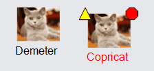
Sometimes you want to have a simple node that may display additional visuals to indicate what state it is in.
One way to implement this is to use a Spot Panel, where the main element is itself a Panel containing the elements that you always want to display, and there are additional objects located at spots around the main element. The basic outline would be:
Node("Spot")
    Panel("Auto")  // the contents with border
        Shape        // the border
        Panel, ...   // the contents
           . . .
    Shape  // the decoration
So the basic body of the node is in a "Vertical" or any kind of Panel, which is surrounded by a border using an "Auto" Panel, which gets decorations using the "Spot" Panel that is also the Node.
The same design of having the Node be a "Spot" Panel can also used for placing ports relative to the body of a node.
  diagram.NodeTemplate =
    new Node("Spot")
      .Add(
        // the main content:
        new Panel("Vertical")
          .Add(
            new Picture { MaxSize = new Size(50, 50) }
              .Bind("Source", "Img"),
            new TextBlock { Margin = new Margin(3, 0, 0, 0) }
              .Bind("Text")
              .Bind("Stroke", "Error", err => (bool)err ? "red" : "black")
          ),
        // decorations
        new Shape("TriangleUp") {
            Alignment = Spot.TopLeft,
            Fill = "yellow", Width = 14, Height = 14,
            Visible = false
          }
          .Bind("Visible", "Error"),
        new Shape("StopSign") {
            Alignment = Spot.TopRight,
            Fill = "red", Width = 14, Height = 14,
            Visible = false
          }
          .Bind("Visible", "Error")
      );

  diagram.Model =
    new MyModel {
      NodeDataSource = new List<NodeData> {
        new NodeData { Text = "Demeter", Img = "images/50x40.png" },
        new NodeData { Text = "Copricat", Img = "images/50x40.png", Error = true }
      }
    };
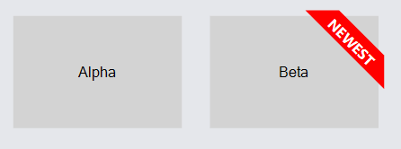
As another example of a node decoration, this implements a "ribbon" at the top right corner of the node. The ribbon is implemented by a Panel that contains both a Shape and a TextBlock, and the panel is positioned by its GraphObject.Alignment and GraphObject.AlignmentFocus in the Spot Panel that also is the Node. The appearance of the ribbon is achieved by using a custom Geometry and binding GraphObject.Opacity.
  diagram.NodeTemplate =
    new Node("Spot") {
        LocationSpot = Spot.Center, LocationElementName = "BODY",
        SelectionElementName = "BODY"
      }
      .Add(
        new Panel("Auto") {
            Name = "BODY", Width = 150, Height = 100,
            PortId = ""
          }
          .Add(
            new Shape { Fill = "lightgray", StrokeWidth = 0 },
            new TextBlock().Bind("Text")
          ),
        new Panel("Spot") {
            // note that the opacity defaults to zero (not visible),
            // in case there is no "ribbon" property
            Opacity = 0,
            Alignment = new Spot(1, 0, 5, -5),
            AlignmentFocus = Spot.TopRight
          }
          .Bind("Opacity", "Ribbon", t => (string)t != "" ? 1 : 0)
          .Add(
            new Shape {
                GeometryString = "F1 M0 0 L30 0 70 40 70 70z",
                Fill = "red", StrokeWidth = 0
              },
            new TextBlock {
                Alignment = new Spot(1, 0, -29, 29),
                Angle = 45, MaxSize = new Size(100, double.NaN),
                Stroke = "white", Font = new Font("Segoe UI", 13, FontWeight.Bold), TextAlign = TextAlign.Center
              }
              .Bind("Text", "Ribbon")
          )
      );

  diagram.Model =
    new MyModel {
      NodeDataSource = new List<NodeData> {
          new NodeData { Text = "Alpha" },
          new NodeData { Text = "Beta", Ribbon = "NEWEST" }
        }
    };
Position and Location
Nodes are positioned in document coordinates.
(For more information, read Coordinate Systems.)
The point at which a Node resides, in document coordinates, is normally the top-left corner of the Node's GraphObject.ActualBounds.
If you set the GraphObject.Position of a Node, you will be modifying the X and Y values of the node's GraphObject.ActualBounds.
However there are times when it is more natural to think that the "point" of a Node is not at the top-left corner but at some other spot within. This is especially true when you want any variably-sized text labels or occasional decorations to be ignored regarding the node's location. That is why Nodes also have a "location" which refers to a point inside the Node. If you set the Part.Location of a Node, you will be lining up the location point of the node to be at that point in document coordinates. When you move a Node you are actually changing its Part.Location.
By default the location of a Node is the same as its position. However you can set the Part.LocationSpot to cause the location point to be at some spot in the node's ActualBounds. Furthermore you can set the Part.LocationElementName to cause the location point to be at some spot in some element within the node. The position will always be at the top-left corner of the whole node, but the location may be some point at some spot in some object within the node.
  diagram.Grid.Visible = true;

  diagram.Add(
    new Node("Vertical") { Position = new Point(0, 0) }  // set the Node.Position
      .Add(
        new TextBlock("Position"),
        new Shape { Name = "SHAPE", Width = 30, Height = 30, Fill = "lightgreen" }
      )
  );

  diagram.Add(
    new Node("Vertical") {
        Location = new Point(100, 0),  // set the Node.Location
        LocationElementName = "SHAPE"  // the location point is on the element named "SHAPE"
      }
      .Add(
        new TextBlock("Location"),
        new Shape { Name = "SHAPE", Width = 30, Height = 30, Fill = "lightgreen" }
      )
  );
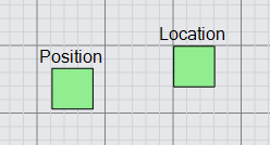
In this example both nodes have the same Y-coordinate value of zero. Note how in the above example the "Position" Node has the top-left corner of the node at the grid point. Yet the "Location" Node has the top-left corner of the green square at the grid point. If you were to edit the text of each node, the green square would move relative to the diagram grid for the "Position" node, but would not move for the "Location" node.
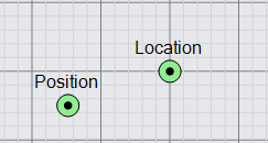
It is common to specify the Part.LocationSpot to be Spot.Center so that the location point
is at the center of some element in the node, rather than at the top-left corner of that element.
  diagram.Grid.Visible = true;

  diagram.Add(
    new Node("Vertical") { Position = new Point(0, 0) }  // set the Node.Position
      .Add(
        new TextBlock("Position"),
        new Panel("Auto")
          .Add(
            new Shape("Circle") { Name = "SHAPE", Width = 16, Height = 16, Fill = "lightgreen" },
            new Shape("Circle") { Width = 6, Height = 6, StrokeWidth = 0 }
          )
      )
  );

  diagram.Add(
    new Node("Vertical") {
        Location = new Point(100, 0),  // set the Node.Location
        LocationElementName = "SHAPE",  // the location point is on the element named "SHAPE"
        LocationSpot = Spot.Center
      }
      .Add(
        new TextBlock("Location"),
        new Panel("Auto")
          .Add(
            new Shape("Circle") { Name = "SHAPE", Width = 16, Height = 16, Fill = "lightgreen" },
            new Shape("Circle") { Width = 6, Height = 6, StrokeWidth = 0 }
          )
      )
  );
If the position or location of a Node is not Point.IsReal, it will not be seen, because GoDiagram will not know where to draw the node.
In fact the default value for a node's position or location is NaN, NaN and it is the responsibility of either the Diagram.Layout
or data bindings to assign real point values for each node.