Buttons
For your convenience we have defined several Panels for common uses. These include "Button", "TreeExpanderButton", "SubGraphExpanderButton", "PanelExpanderButton", and "ContextMenuButton".
They are implemented as simple visual trees of GraphObjects in Panels, with pre-set properties and event handlers.
You can see a copy of their definitions in this file: Buttons.cs.
See samples that make use of buttons in the samples index. In addition, see the Checkboxes extension for an example of using "CheckBoxButton".
General Buttons
The most general kind of predefined Panel is "Button".
  var incrementCounter = new Action<InputEvent, GraphObject>((e, obj) => {
    var node = obj.Part;
    var data = node.Data as NodeData;
    if (data != null) {
      node.Diagram.Model.Commit(m => {
        m.Set(data, "ClickCount", data.ClickCount + 1);
      }, "clicked");
    }
  });

  diagram.NodeTemplate =
    new Node("Auto") { LocationSpot = Spot.Center }
      .Add(
        new Shape { Fill = "gold" },
        new Panel("Vertical") { Margin = 3 }
          .Add(
            Builder.Make<Panel>("Button")
              .Set(new {
                Margin = 2,
                Click = incrementCounter
              })
              .Add(new TextBlock("Click me!")),
            new TextBlock()
              .Bind("Text", "ClickCount", c => "Clicked " + c + " times.")
          )
      );

  diagram.Model =
    new MyModel {
      NodeDataSource = new List<NodeData> {
        new NodeData { ClickCount = 0 }
      }
    };
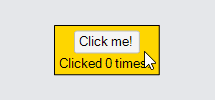
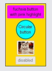
Buttons are just Panels holding a Shape that will surround whatever content you give it. The border Shape is named "ButtonBorder" so that you can easily set or bind its properties.
The event handlers defined by all "Button"s make use of additional properties, not defined in the API, but that you can see in the definition of "Button": Buttons.cs. These properties parameterize the appearance of the button.
  diagram.NodeTemplate =
    new Node("Auto") { LocationSpot = Spot.Center }
      .Add(
        new Shape { Fill = "gold" },
        new Panel("Vertical") { Margin = 3 }
          .Add(
            Builder.Make<Panel>("Button")
              .Set(new {
                Margin = 2,
                // set properties on the border Shape of the "Button"
                ButtonBorder_Fill = "fuchsia",
                // set properties on the "Button" itself used by its event handlers
                _ButtonFillOver = "pink"
              })
              .Add(
                new TextBlock("fuchsia button\nwith pink highlight") {
                  Margin = 2, TextAlign = TextAlign.Center
                }
              ),
            Builder.Make<Panel>("Button")
              .Set(new {
                Margin = 2,
                // set properties on the border Shape of the "Button"
                ButtonBorder_Figure = "Circle",
                ButtonBorder_Fill = "cyan",
                ButtonBorder_Stroke = "darkcyan",
                ButtonBorder_StrokeWidth = 3,
                // set properties on the "Button" itself used by its event handlers
                _ButtonFillOver = "white",
                _ButtonStrokeOver = "cyan",
                _ButtonFillPressed = "lightgray"
              })
              .Add(
                new TextBlock("Circular\nbutton") {
                  Margin = 2, TextAlign = TextAlign.Center
                }
              ),
            Builder.Make<Panel>("Button")
              .Set(new { Margin = 2 })
              .Add(
                // the button content can be anything -- it doesn't have to be a TextBlock
                new Picture("Images/50x40.png") { Name = "PIC", Width = 50, Height = 40 }
              ),
            Builder.Make<Panel>("Button")
              .Set(new {
                Margin = 2,
                // buttons can be disabled too, by either setting or data binding:
                IsEnabled = false
              })
              .Add(
                new TextBlock("disabled") {
                  Margin = 2, TextAlign = TextAlign.Center, Stroke = "gray"
                }
              )
          )
      );

  diagram.Model =
    new MyModel {
      NodeDataSource = new List<NodeData> {
        new NodeData()
      }
    };
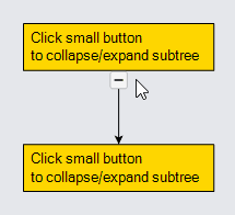
TreeExpanderButtons
It is common to want to expand and collapse subtrees. It is easy to let the user control this by adding an instance of the "TreeExpanderButton" to your node template. The button calls CommandHandler.CollapseTree or CommandHandler.ExpandTree depending on the value of Node.IsTreeExpanded. The button's icon's Shape.Figure changes as the value of Node.IsTreeExpanded changes.
  diagram.NodeTemplate =
    new Node("Spot")
      .Add(
        new Panel("Auto")
          .Add(
            new Shape { Fill = "gold" },
            new TextBlock("Click small button\nto collapse/expand subtree") { Margin = 5 }
          ),
        Builder.Make<Panel>("TreeExpanderButton")
          .Set(new {
            Alignment = Spot.Bottom, AlignmentFocus = Spot.Top
          })
      );

  diagram.Layout = new TreeLayout { Angle = 90 };

  diagram.Model =
    new MyModel {
      NodeDataSource = new List<NodeData> {
        new NodeData { Key = 1 },
        new NodeData { Key = 2 }
      },
      LinkDataSource = new List<LinkData> {
        new LinkData { From = 1, To = 2 }
      }
    };
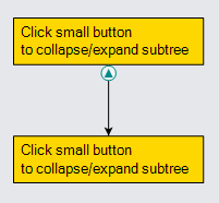
A "TreeExpanderButton" is a "Button" that holds a Shape displaying either a "MinusLine" or a "PlusLine" figure, depending on the value of the Node.IsTreeExpanded. That shape is named "ButtonIcon", so that you can easily set or bind its properties, in addition to the properties of the "ButtonBorder" and of the "Button" itself.
  diagram.NodeTemplate =
    new Node("Spot")
      .Add(
        new Panel("Auto")
          .Add(
            new Shape { Fill = "gold" },
            new TextBlock("Click small button\nto collapse/expand subtree") { Margin = 5 }
          ),
        Builder.Make<Panel>("TreeExpanderButton")
          .Set(new {
            Alignment = Spot.Bottom, AlignmentFocus = Spot.Top,
            // set the two additional properties used by "TreeExpanderButton"
            // that control the shape depending on the value of Node.IsTreeExpanded
            _TreeExpandedFigure = "TriangleUp",
            _TreeCollapsedFigure = "TriangleDown",
            // set properties on the icon within the border
            ButtonIcon_Fill = "darkcyan",
            ButtonIcon_StrokeWidth = 0,
            // set general "Button" properties
            ButtonBorder_Figure = "Circle",
            ButtonBorder_Stroke = "darkcyan",
            _ButtonStrokeOver = "darkcyan"
          })
      );

  diagram.Layout = new TreeLayout { Angle = 90 };

  diagram.Model =
    new MyModel {
      NodeDataSource = new List<NodeData> {
        new NodeData { Key = 1 },
        new NodeData { Key = 2 }
      },
      LinkDataSource = new List<LinkData> {
        new LinkData { From = 1, To = 2 }
      }
    };
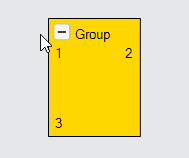
SubGraphExpanderButtons
It is also common to want to expand and collapse groups containing subgraphs. You can let the user control this by adding an instance of the "SubGraphExpanderButton" to your group template. The button calls CommandHandler.CollapseSubGraph or CommandHandler.ExpandSubGraph depending on the value of Group.IsSubGraphExpanded. The button's icon's Shape.Figure changes as the value of Group.IsSubGraphExpanded changes.
  diagram.GroupTemplate =
    new Group("Auto")
      .Add(
        new Shape { Fill = "gold" },
        new Panel("Vertical") { Margin = 5, DefaultAlignment = Spot.Left }
          .Add(
            new Panel("Horizontal")
              .Add(
                Builder.Make<Panel>("SubGraphExpanderButton")
                  .Set(new {
                    Margin = new Margin(0, 3, 5, 0)
                  }),
                new TextBlock("Group")
              ),
            new Placeholder()
          )
      );

  diagram.Model =
    new MyModel {
      NodeDataSource = new List<NodeData> {
        new NodeData { Key = -1, IsGroup = true },
        new NodeData { Key = 1, Group = -1 },
        new NodeData { Key = 2, Group = -1 },
        new NodeData { Key = 3, Group = -1 }
      }
    };
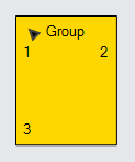
A "SubGraphExpanderButton" is like a "TreeExpanderButton" in its being a "Button" with a border Shape surrounding an icon Shape. That shape is named "ButtonIcon", so that you can easily set or bind its properties, in addition to the properties of the "ButtonBorder" and of the "Button" itself.
  diagram.GroupTemplate =
    new Group("Auto")
      .Add(
        new Shape { Fill = "gold" },
        new Panel("Vertical") { Margin = 5, DefaultAlignment = Spot.Left }
          .Add(
            new Panel("Horizontal")
              .Add(
                Builder.Make<Panel>("SubGraphExpanderButton")
                  .Set(new {
                    // set the two additional properties used by "SubGraphExpanderButton"
                    // that control the shape depending on the value of Group.IsSubGraphExpanded
                    _SubGraphExpandedFigure = "TriangleUp",
                    _SubGraphCollapsedFigure = "TriangleDown",
                    // set other properties on the button icon
                    ButtonIcon_Angle = -45,
                    // and properties on the button border or the button itself
                    ButtonBorder_Opacity = 0
                  }),
                new TextBlock("Group")
              ),
            new Placeholder()
          )
      );

  diagram.Model =
    new MyModel {
      NodeDataSource = new List<NodeData> {
        new NodeData { Key = -1, IsGroup = true },
        new NodeData { Key = 1, Group = -1 },
        new NodeData { Key = 2, Group = -1 },
        new NodeData { Key = 3, Group = -1 }
      }
    };
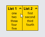
PanelExpanderButtons
It is common to want to expand and collapse a piece of a node, thereby showing or hiding details that are sometimes not needed. It is easy to let the user control this by adding an instance of the "PanelExpanderButton" to your node template. The second argument to Builder.Make should be a string that names the element in the node whose GraphObject.Visible property you want the button to toggle.
  diagram.NodeTemplate =
    new Node("Auto")
      .Add(
        new Shape { Fill = "gold" },
        new Panel("Table") { DefaultAlignment = Spot.Top, DefaultColumnSeparatorStroke = "black" }
          .Add(
            new Panel("Table") { Column = 0 }
              .Add(
                new TextBlock("List 1") {
                    Column = 0, Margin = new Margin(3, 3, 0, 3),
                    Font = new Font("Segoe UI", 15, FontWeight.Bold)
                  },
                Builder.Make<Panel>("PanelExpanderButton", "LIST1")
                  .Set(new { Column = 1 }),
                new Panel("Vertical") { Name = "LIST1", Row = 1, Column = 0, ColumnSpan = 2 }
                  .Bind("ItemList", "List1")
              ),
            new Panel("Table") { Column = 1 }
              .Add(
                new TextBlock("List 2") {
                    Column = 0, Margin = new Margin(3, 3, 0, 3),
                    Font = new Font("Segoe UI", 15, FontWeight.Bold)
                  },
                Builder.Make<Panel>("PanelExpanderButton", "LIST2")
                  .Set(new { Column = 1 }),
                new Panel("Vertical") { Name = "LIST2", Row = 1, Column = 0, ColumnSpan = 2 }
                  .Bind("ItemList", "List2")
              )
          )
      );

  diagram.Model =
    new MyModel {
      NodeDataSource = new List<NodeData> {
        new NodeData {
          Key = 1,
          List1 = new List<string> { "one", "two", "three", "four", "five" },
          List2 = new List<string> { "first", "second", "third", "fourth" },
        }
      }
    };
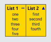
A "PanelExpanderButton" is like a "TreeExpanderButton" or "SubGraphExpanderButton" in its being a "Button" with a border Shape surrounding an icon Shape. However, this panel binds the Shape.GeometryString rather than the Shape.Figure.
  diagram.NodeTemplate =
    new Node("Auto")
      .Add(
        new Shape { Fill = "gold" },
        new Panel("Table") { DefaultAlignment = Spot.Top, DefaultColumnSeparatorStroke = "black" }
          .Add(
            new Panel("Table") { Column = 0 }
              .Add(
                new TextBlock("List 1") {
                    Column = 0, Margin = new Margin(3, 3, 0, 3),
                    Font = new Font("Segoe UI", 15, FontWeight.Bold)
                  },
                Builder.Make<Panel>("PanelExpanderButton", "LIST1")
                  .Set(new {
                    Column = 1,
                    // set the two additional properties used by "PanelExpanderButton"
                    // that control the shape depending on the value of GraphObject.Visible
                    // of the object named "LIST1"
                    _ButtonExpandedFigure = "M0 0 L10 0",
                    _ButtonCollapsedFigure = "M0 5 L10 5 M5 0 L5 10",
                    ButtonIcon_Stroke = "blue",
                    Height = 16
                  }),
                new Panel("Vertical") { Name = "LIST1", Row = 1, Column = 0, ColumnSpan = 2 }
                  .Bind("ItemList", "List1")
              ),
            new Panel("Table") { Column = 1 }
              .Add(
                new TextBlock("List 2") {
                    Column = 0, Margin = new Margin(3, 3, 0, 3),
                    Font = new Font("Segoe UI", 15, FontWeight.Bold)
                  },
                Builder.Make<Panel>("PanelExpanderButton", "LIST2")
                  .Set(new {
                    Column = 1,
                    // set the two additional properties used by "PanelExpanderButton"
                    // that control the shape depending on the value of GraphObject.Visible
                    // of the object named "LIST2"
                    _ButtonExpandedFigure = "F M0 10 L5 0 10 10z",
                    _ButtonCollapsedFigure = "F M0 0 L10 0 5 10z",
                    ButtonIcon_StrokeWidth = 0,
                    ButtonIcon_Fill = "blue"
                  }),
                new Panel("Vertical") { Name = "LIST2", Row = 1, Column = 0, ColumnSpan = 2 }
                  .Bind("ItemList", "List2")
              )
          )
      );

  diagram.Model =
    new MyModel {
      NodeDataSource = new List<NodeData> {
        new NodeData {
          Key = 1,
          List1 = new List<string> { "one", "two", "three", "four", "five" },
          List2 = new List<string> { "first", "second", "third", "fourth" },
        }
      }
    };
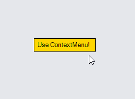
ContextMenuButtons
Although you can implement context menus in any way you choose, it is common to use the predefined "ContextMenuButton".
diagram.NodeTemplate =
new Node("Auto")
.Add(
new Shape { Fill = "gold" },
new TextBlock("Use ContextMenu!") { Margin = 5 }
);
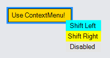
void shiftNode(GraphObject obj, int dist) {
var adorn = obj.Part as Adornment;
var node = adorn.AdornedPart;
node.Diagram.Commit(d => {
var pos = node.Location;
pos.X += dist;
node.Location = pos;
}, "Shift");
}
diagram.NodeTemplate.ContextMenu =
Builder.Make<Adornment>("ContextMenu")
.Add(
Builder.Make<Panel>("ContextMenuButton")
.Set(new {
Click = new Action<InputEvent, GraphObject>((e, obj) => {
shiftNode(obj, -20);
})
})
.Add(new TextBlock("Shift Left")),
Builder.Make<Panel>("ContextMenuButton")
.Set(new {
Click = new Action<InputEvent, GraphObject>((e, obj) => {
shiftNode(obj, 20);
})
})
.Add(new TextBlock("Shift Right"))
);
diagram.Model =
new MyModel {
NodeDataSource = new List<NodeData> {
new NodeData { Key = 1 }
}
};
A "ContextMenuButton" is just a "Button" with a few properties set.
One of those properties is GraphObject.Stretch, which is set to
StretchMode.Horizontal so that all of the "ContextMenuButton"s
in a "ContextMenu" will be stretch to the same width.
But you can set all of the usual properties on both its "ButtonBorder" Shape
as well as on the button itself.
  diagram.NodeTemplate =
    new Node("Auto")
      .Add(
        new Shape { Fill = "gold" },
        new TextBlock("Use ContextMenu!") { Margin = 5 }
      );

  void shiftNode(GraphObject obj, int dist) {
    var adorn = obj.Part as Adornment;
    var node = adorn.AdornedPart;
    node.Diagram.Commit(d => {
      var pos = node.Location;
      pos.X += dist;
      node.Location = pos;
    }, "Shift");
  }

  diagram.NodeTemplate.ContextMenu =
    Builder.Make<Adornment>("ContextMenu")
      .Add(
        Builder.Make<Panel>("ContextMenuButton")
          .Set(new {
            ButtonBorder_Fill = "yellow",
            _ButtonFillOver = "cyan",
            _ButtonFillPressed = "lime",
            Click = new Action<InputEvent, GraphObject>((e, obj) => {
              shiftNode(obj, -20);
            })
          })
          .Add(new TextBlock("Shift Left")),
        Builder.Make<Panel>("ContextMenuButton")
          .Set(new {
            ButtonBorder_Fill = "yellow",
            _ButtonFillOver = "cyan",
            _ButtonFillPressed = "lime",
            Click = new Action<InputEvent, GraphObject>((e, obj) => {
              shiftNode(obj, 20);
            })
          })
          .Add(new TextBlock("Shift Right")),
        Builder.Make<Panel>("ContextMenuButton")
          .Set(new {
            IsEnabled = false,
            Click = new Action<InputEvent, GraphObject>((e, obj) => {
              Console.WriteLine("won't write");
            })
          })
          .Add(new TextBlock("Disabled"))
      );

  diagram.Model =
    new MyModel {
      NodeDataSource = new List<NodeData> {
        new NodeData { Key = 1 }
      }
    };
See also the fancier round context menu implemented in Radial Context Menu.
Button Definitions
The implementation of all predefined buttons is provided in Buttons.cs in the Extensions directory. You may wish to copy and adapt these definitions when creating your own buttons.
Those definitions might not be an up-to-date description of the actual standard button implementations that are in GoDiagram.
Note that the definitions of those buttons makes use of the Builder.DefineBuilder static function. You can find the definitions of various kinds of controls throughout the samples and extensions, such as at: