Grid Patterns
It is common to want to display a grid of lines drawn at regular intervals. You may also want to force dragged parts to be aligned on grid points, and to resize parts to be multiples of the grid cell size.
Grids are implemented using a type of Panel, PanelLayoutGrid. Grid Panels, like most other types of Panels, can be used within Nodes or any other kind of Part. However when they are used as the Diagram.Grid, they are effectively infinite in extent.
Unlike in other kinds of Panels, Grid Panel elements must be Shapes that are only used to control how the grid lines or grid bars are drawn.
See samples that make use of grids in the samples index.
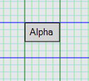
Default Grid
To display a grid pattern in the background of the diagram, you can just make the Diagram.Grid visible:
  diagram.Grid.Visible = true;

  diagram.NodeTemplate =
    new Node("Auto")
      .Add(
        new Shape { Fill = "lightgray" },
        new TextBlock { Margin = 5 }
          .Bind("Text", "Key")
      );

  diagram.Model =
    new MyModel {
      NodeDataSource = new List<NodeData> {
        new NodeData { Key = "Alpha" },
        new NodeData { Key = "Beta" },
        new NodeData { Key = "Gamme" }
      }
    };
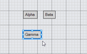
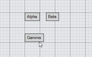
Grid Snapping
The DraggingTool and ResizingTool can change their behavior based on the background grid pattern, if you set the DraggingTool.IsGridSnapEnabled and/or ResizingTool.IsGridSnapEnabled properties to true.
Setting DraggingTool.IsGridSnapEnabled to true will not affect disconnected Links, but these can snap if you define a custom Part.DragComputation to do so on the Link template.
  diagram.Grid.Visible = true;
  diagram.ToolManager.DraggingTool.IsGridSnapEnabled = true;
  diagram.ToolManager.ResizingTool.IsGridSnapEnabled = true;

  diagram.NodeTemplate =
    new Node("Auto") { Resizable = true }
      .Add(
        new Shape { Fill = "lightgray" },
        new TextBlock { Margin = 5 }
          .Bind("Text", "Key")
      );

  diagram.Model =
    new MyModel {
      NodeDataSource = new List<NodeData> {
        new NodeData { Key = "Alpha" },
        new NodeData { Key = "Beta" },
        new NodeData { Key = "Gamma" }
      }
    };
Simple Grid Customization
You can change the size of the grid cell by setting Panel.GridCellSize:
  diagram.Grid.Visible = true;
  diagram.Grid.GridCellSize = new Size(30, 30);
  diagram.ToolManager.DraggingTool.IsGridSnapEnabled = true;
  diagram.ToolManager.ResizingTool.IsGridSnapEnabled = true;

  diagram.NodeTemplate =
    new Node("Auto") { Resizable = true }
      .Add(
        new Shape { Fill = "lightgray" },
        new TextBlock { Margin = 5 }
          .Bind("Text", "Key")
      );

  diagram.Model =
    new MyModel {
      NodeDataSource = new List<NodeData> {
        new NodeData { Key = "Alpha" },
        new NodeData { Key = "Beta" },
        new NodeData { Key = "Gamma" }
      }
    };
The cell size used when snapping the locations of Parts during a drag need not be exactly the same as the background grid's cell size. The value of DraggingTool.GridSnapCellSize takes precedence over the Panel.GridCellSize. Note that if DraggingTool.GridSnapCellSize is set but ResizingTool.CellSize is not, Parts will use the DraggingTool.gridSnapCellSize value when resizing.
  diagram.Grid.Visible = true;
  diagram.ToolManager.DraggingTool.IsGridSnapEnabled = true;
  diagram.ToolManager.ResizingTool.IsGridSnapEnabled = true;

  // snap to every other point both vertically and horizontally
  // (the default background grid has a cell size of 10x10)
  diagram.ToolManager.DraggingTool.GridSnapCellSize = new Size(20, 20);

  diagram.NodeTemplate =
    new Node("Auto") { Resizable = true }
      .Add(
        new Shape { Fill = "lightgray" },
        new TextBlock { Margin = 5 }
          .Bind("Text", "Key")
      );

  diagram.Model =
    new MyModel {
      NodeDataSource = new List<NodeData> {
        new NodeData { Key = "Alpha" },
        new NodeData { Key = "Beta" },
        new NodeData { Key = "Gamma" }
      }
    };
Custom Grids
Grid patterns are implemented by the Panel class when its Panel.Type is PanelLayoutGrid. The elements of a Grid Panel must be Shapes whose Shape.Figure is one of a small set of known kinds of figures. The only figures it can accept are: "LineH", "LineV", "BarH", and "BarV". The two "Line" figures result in stroked lines separating the grid cells; the two "Bar" figures result in filled rectangles in the grid cells.
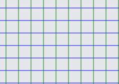
Here is a simple grid consisting of blue horizontal lines and green vertical lines:
  diagram.Grid =
    new Panel("Grid") { GridCellSize = new Size(25, 25) }
      .Add(
        new Shape("LineH") { Stroke = "blue" },
        new Shape("LineV") { Stroke = "green" }
      );
The Shape.Interval property is also used by a Grid Panel to determine how frequently a line should be drawn. The value should be a positive integer specifying how many cells there are between drawings of this particular line. So if you wanted darker blue and darker green lines every five cells:
  diagram.Grid =
    new Panel("Grid") { GridCellSize = new Size(10, 10) }
      .Add(
        new Shape("LineH") { Stroke = "lightblue" },
        new Shape("LineV") { Stroke = "lightgreen" },
        new Shape("LineH") { Stroke = "blue", Interval = 5 },
        new Shape("LineV") { Stroke = "green", Interval = 5 }
      );


  diagram.NodeTemplate =
    new Node("Auto") { Resizable = true }
      .Add(
        new Shape { Fill = "lightgray" },
        new TextBlock { Margin = 5 }
          .Bind("Text", "Key")
      );

  diagram.Model =
    new MyModel {
      NodeDataSource = new List<NodeData> {
        new NodeData { Key = "Alpha" }
      }
    };
Note that the Shapes are drawn in the order in which they appear in the Panel, so you can see that the dark blue horizontal lines are drawn in front of the light green vertical lines, and that the dark green vertical line crosses in front of the dark blue horizontal lines.
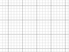
Here is the definition of the predefined Diagram.Grid:
  diagram.Grid =
    new Panel("Grid") {
        Name = "GRID",
        Visible = false,
        GridCellSize = new Size(10, 10),
        GridOrigin = new Point(0, 0)
      }
      .Add(
        new Shape("LineH") { Stroke = "lightgray", StrokeWidth = 0.5, Interval = 1 },
        new Shape("LineH") { Stroke = "gray", StrokeWidth = 0.5, Interval = 5 },
        new Shape("LineH") { Stroke = "gray", StrokeWidth = 1.0, Interval = 10 },
        new Shape("LineV") { Stroke = "lightgray", StrokeWidth = 0.5, Interval = 1 },
        new Shape("LineV") { Stroke = "gray", StrokeWidth = 0.5, Interval = 5 },
        new Shape("LineV") { Stroke = "gray", StrokeWidth = 1.0, Interval = 10 }
      );

  diagram.Grid.Visible = true;  // so that this example shows the standard grid
You can get a green-bar pattern by using the "BarH" figure. Note the use of Shape.Fill instead of Shape.Stroke and explicitly setting the GraphObject.Height:
  diagram.Grid =
    new Panel("Grid") { GridCellSize = new Size(50, 50) }
      .Add(
        new Shape("BarH") { Fill = "lightgreen", Interval = 2, Height = 50 }
      );

  diagram.NodeTemplate =
    new Node("Auto") {
        DragComputation = (node, pt, gridpt) => {
          pt.Y = Math.Round(pt.Y / 100) * 100;
          return pt;
        }
      }
      .Add(
        new Shape { Fill = "lightgray" },
        new TextBlock { Margin = 5 }
          .Bind("Text", "Key")
      );

  diagram.Model =
    new MyModel {
      NodeDataSource = new List<NodeData> {
        new NodeData { Key = "Alpha" }
      }
    };
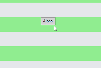
This example also demonstrates how one can use the Part.DragComputation property to customize where the user can drag the node. In this case the Part.Location.y is limited to be multiples of 100, corresponding to the rows of cells filled by the green bars.
To get a tablecloth effect, one can use both vertical and horizontal bars with a translucent color:
  diagram.Grid =
    new Panel("Grid") { GridCellSize = new Size(100, 100) }
      .Add(
        new Shape("BarV") { Fill = "rgba(255,0,0,0.1)", Width = 50 },
        new Shape("BarH") { Fill = "rgba(255,0,0,0.1)", Height = 50 }
      );

  diagram.ToolManager.DraggingTool.IsGridSnapEnabled = true;

  diagram.NodeTemplate =
    new Node("Auto") { Width = 50, Height = 50 }
      .Add(
        new Shape { Fill = "lightgray" },
        new TextBlock { Margin = 5 }
          .Bind("Text", "Key")
      );

  diagram.Model =
    new MyModel {
      NodeDataSource = new List<NodeData> {
        new NodeData { Key = "Alpha" }
      }
    };
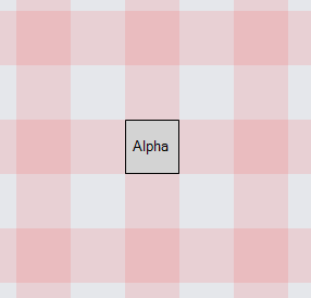
This example limits dragging of all nodes by setting DraggingTool.IsGridSnapEnabled to true.
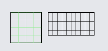
Here is an example of using a "Grid" Panel as a regular data bound element in a Node:
  diagram.NodeTemplate =
    new Node("Auto") { Resizable = true, ResizeElementName = "GRID" }
      .Add(
        new Shape { StrokeWidth = 2, Fill = "transparent" },
        new Panel("Grid") {
            Name = "GRID",
            DesiredSize = new Size(100, 100),
            GridCellSize = new Size(20, 20)
          }
          .Bind("DesiredSize", "Size", Size.Parse, Size.Stringify)
          .Bind("GridCellSize", "Cell", Size.Parse, Size.Stringify)
          .Add(
            new Shape("LineV").Bind("Stroke"),
            new Shape("LineH").Bind("Stroke")
          )
      );

  diagram.Model =
    new MyModel {
      NodeDataSource = new List<NodeData> {
        new NodeData { Key = "Alpha", Cell = "25 25", Stroke = "lightgreen" },
        new NodeData { Key = "Beta", Size = "150 75", Cell = "15 30" }
      }
    };
Other Considerations
A Grid Panel should have a non-null Background if it needs to be pickable.
One cannot set or bind the Panel.ItemList of a Grid Panel.
Events on the Shapes will be ignored. Shapes in a Grid Panel must not be scaled or rotated.