Table Panels
The "Table" Panel, PanelLayoutTable, arranges objects in rows and columns.
See samples that make use of tables in the samples index.
Simple Table Panels
Each object in a Table Panel is put into the cell indexed by the value of GraphObject.Row and GraphObject.Column. The panel will look at the rows and columns for all of the objects in the panel to determine how many rows and columns the table should have.
  diagram.Add(
    // all Parts are Panels
    new Part("Table")
      .Add(
        new TextBlock("Row 0\nCol0")
          { Row = 0, Column = 0, Margin = 2, Background = "lightgray" },
        new TextBlock("Row 0\nCol1")
          { Row = 0, Column = 1, Margin = 2, Background = "lightgray" },
        new TextBlock("Row 1\nCol0")
          { Row = 1, Column = 0, Margin = 2, Background = "lightgray" },
        new TextBlock("Row 1\nCol2")
          { Row = 1, Column = 2, Margin = 2, Background = "lightgray" }
      )
  );
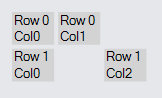
Note that not every "cell" of the table needs to have a GraphObject in it.
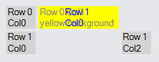
If there are multiple objects in a cell, they will probably overlap each other in the cell. By default objects are center-aligned in each cell.
  diagram.Add(
    new Part("Table")
      .Add(
        new TextBlock("Row 0\nCol0")
          { Row = 0, Column = 0, Margin = 2, Background = "lightgray" },
        new TextBlock("Row 0 Col1\nyellow background") {
          // first object in the cell (row: 0, col: 1)
          Row = 0, Column = 1, Margin = 2,
          Background = "yellow", Stroke = "gray"
        },
        new TextBlock("Row 1\nCol0") {
          // second object in that cell overlaps the first one,
          // the bigger yellow TextBlock
          Row = 0, Column = 1, Margin = 2,
          Background = "transparent", Stroke = "blue"
        },
        new TextBlock("Row 1\nCol0")
          { Row = 1, Column = 0, Margin = 2, Background = "lightgray" },
        new TextBlock("Row 1\nCol2")
          { Row = 1, Column = 2, Margin = 2, Background = "lightgray" }
      )
  );
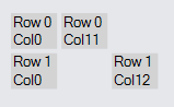
If a column or a row has no objects in it, that column or row is ignored.
  diagram.Add(
    new Part("Table")
      .Add(
        new TextBlock("Row 0\nCol0")
          { Row = 0, Column = 0, Margin = 2, Background = "lightgray" },
        new TextBlock("Row 0\nCol11")  // column 11 -- nothing in columns 1-10
          { Row = 0, Column = 11, Margin = 2, Background = "lightgray" },
        new TextBlock("Row 1\nCol0")
          { Row = 1, Column = 0, Margin = 2, Background = "lightgray" },
        new TextBlock("Row 1\nCol12")  // column 12
          { Row = 1, Column = 12, Margin = 2, Background = "lightgray" }
      )
  );
Sizing of Rows or Columns
The height of each row is normally determined by the greatest height of all of the objects in that row. Similarly, the width of each column is normally determined by the greatest width of all of the objects in that column. However you can provide row height or column width information for any row or column independent of any individual object by setting properties of the desired RowDefinition or ColumnDefinition of the Table panel.
To fix a column width or a row height in code you can call Panel.GetColumnDefinition or Panel.GetRowDefinition and then set ColumnDefinition.Width or RowDefinition.Height. If you want to limit the width or height to certain ranges, set the ColumnDefinition.MinWidth or ColumnDefinition.MaxWidth. If the maximum and the width or height conflict, the maximum takes precedence. For example, if the maximum is 70 but the natural value is 80, the actual value is limited to 70. If that value conflicts with the minimum, the minimum takes precedence. For example, if the minimum is 50 but the natural value is 40, the actual value is 50.
This example demonstrates how the column width may be controlled.
  diagram.Add(
    new Part("Table") { DefaultAlignment = Spot.Left }
      .Add(
        new ColumnDefinition { Column = 0, Width = 100 },
        new ColumnDefinition { Column = 1, Width = 100, MinWidth = 150 },
        new ColumnDefinition { Column = 2, Width = 100, MaxWidth = 50 },
        new ColumnDefinition { Column = 3, Width = 100, MinWidth = 150, MaxWidth = 50 }
      )
      .Add(
        new TextBlock("Text Block")
          { Row = 0, Column = 0, Background = "green" },
        new TextBlock("Text Block")
          { Row = 0, Column = 1, Background = "red" },
        new TextBlock("Text Block")
          { Row = 0, Column = 2, Background = "yellow" },
        new TextBlock("Text Block")
          { Row = 0, Column = 3, Background = "red" },
        new Panel("Auto") { Row = 1, Column = 0 }
          .Add(
            new Shape("RoundedRectangle") { Fill = "green" },
            new TextBlock("Auto Panel")
          ),
        new Panel("Auto") { Row = 1, Column = 1 }
          .Add(
            new Shape("RoundedRectangle") { Fill = "red" },
            new TextBlock("Auto Panel")
          ),
        new Panel("Auto") { Row = 1, Column = 2 }
          .Add(
            new Shape("RoundedRectangle") { Fill = "yellow" },
            new TextBlock("Auto Panel")
          ),
        new Panel("Auto") { Row = 1, Column = 3 }
          .Add(
            new Shape("RoundedRectangle") { Fill = "red" },
            new TextBlock("Auto Panel")
          ),
        new TextBlock("Width: 100") { Row = 2, Column = 0 },
        new TextBlock("Min: 150") { Row = 2, Column = 1 },
        new TextBlock("Max: 50") { Row = 2, Column = 2 },
        new TextBlock("Min & Max") { Row = 2, Column = 3 }
      )
  );
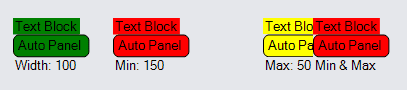
Note how the column with a minimum of 150 has a lot of extra space in it, and how the column with a maximum of 50 results in its elements being clipped.
Stretch and Alignment
The size of a GraphObject in a Panel is determined by many factors. The GraphObject.Stretch property specifies whether the width and/or height should take up all of the space given to it by the Panel. When the width and/or height is not stretched to fill the given space, the GraphObject.Alignment property controls where the object is placed if it is smaller than available space. One may also stretch the width while aligning vertically, just as one may also stretch vertically while aligning along the X axis.
The alignment value for a GraphObject, if not given by the value of GraphObject.Alignment, may be inherited. If the object is in a Table Panel, the value may inherit from the RowDefinition.Alignment and ColumnDefinition.Alignments of the row and of the column that the object is in. Finally the value may be inherited from the Panel.DefaultAlignment property.
The same inheritance is true for the stretch value for a GraphObject: GraphObject.Stretch, RowDefinition.Stretch and ColumnDefinition.Stretch, and finally Panel.DefaultStretch.
Alignment in Columns
diagram.Add(
new Part("Table") { DefaultAlignment = Spot.Left }
.Add(
new ColumnDefinition { Column = 0, Width = 200 },
new ColumnDefinition { Column = 1, Width = 15 }
)
.Add(
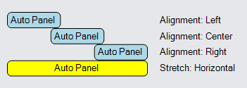
new Panel("Auto") { Row = 0, Column = 0, Alignment = Spot.Left }
.Add(
new Shape("RoundedRectangle") { Fill = "lightblue" },
new TextBlock("Auto Panel")
),
new TextBlock("Alignment: Left") { Row = 0, Column = 2 },
new Panel("Auto") { Row = 1, Column = 0, Alignment = Spot.Center }
.Add(
new Shape("RoundedRectangle") { Fill = "lightblue" },
new TextBlock("Auto Panel")
),
new TextBlock("Alignment: Center") { Row = 1, Column = 2 },
new Panel("Auto") { Row = 2, Column = 0, Alignment = Spot.Right }
.Add(
new Shape("RoundedRectangle") { Fill = "lightblue" },
new TextBlock("Auto Panel")
),
new TextBlock("Alignment: Right") { Row = 2, Column = 2 },
new Panel("Auto") { Row = 3, Column = 0, Stretch = Stretch.Horizontal }
.Add(
new Shape("RoundedRectangle") { Fill = "yellow" },
new TextBlock("Auto Panel")
),
new TextBlock("Stretch: Horizontal") { Row = 3, Column = 2 }
)
);
Alignment in Rows
diagram.Add(
new Part("Table") { DefaultAlignment = Spot.Top }
.Add(
new RowDefinition { Row = 0, Height = 50 },
new RowDefinition { Row = 1, Height = 15 }
)
.Add(
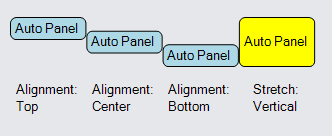
new Panel("Auto") { Row = 0, Column = 0, Alignment = Spot.Top }
.Add(
new Shape("RoundedRectangle") { Fill = "lightblue" },
new TextBlock("Auto Panel")
),
new TextBlock("Alignment:\nTop") { Row = 2, Column = 0 },
new Panel("Auto") { Row = 0, Column = 1, Alignment = Spot.Center }
.Add(
new Shape("RoundedRectangle") { Fill = "lightblue" },
new TextBlock("Auto Panel")
),
new TextBlock("Alignment:\nCenter") { Row = 2, Column = 1 },
new Panel("Auto") { Row = 0, Column = 2, Alignment = Spot.Bottom }
.Add(
new Shape("RoundedRectangle") { Fill = "lightblue" },
new TextBlock("Auto Panel")
),
new TextBlock("Alignment:\nBottom") { Row = 2, Column = 2 },
new Panel("Auto") { Row = 0, Column = 3, Stretch = Stretch.Vertical }
.Add(
new Shape("RoundedRectangle") { Fill = "yellow" },
new TextBlock("Auto Panel")
),
new TextBlock("Stretch:\nVertical") { Row = 2, Column = 3 }
)
);
Spanning Rows or Columns
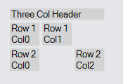
An element in a Table Panel cell can cover more than one cell if you set the GraphObject.RowSpan or GraphObject.ColumnSpan properties. For example, if the value of GraphObject.ColumnSpan is greater than one, it specifies how many columns that object may cover, starting with the value of GraphObject.Column, but excluding the column indexed by Column + ColumnSpan.
  diagram.Add(
    new Part("Table")
      .Add(
        new TextBlock("Three Col Header") {  // spans all three columns
          Row = 0, Column = 0, ColumnSpan = 3, Stretch = Stretch.Horizontal,
          Margin = 2, Background = "lightgray"
        },
        new TextBlock("Row 1\nCol0") { Row = 1, Column = 0, Margin = 2, Background = "lightgray" },
        new TextBlock("Row 1\nCol1") { Row = 1, Column = 1, Margin = 2, Background = "lightgray" },
        new TextBlock("Row 2\nCol0") { Row = 2, Column = 0, Margin = 2, Background = "lightgray" },
        new TextBlock("Row 2\nCol2") { Row = 2, Column = 2, Margin = 2, Background = "lightgray" }
      )
  );
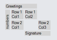
Here is an example that includes both column spanning and row spanning.
  diagram.Add(
    new Part("Table")
      .Add(
        new TextBlock("Greetings") {
          Row = 0, Column = 0, ColumnSpan = 3, Stretch = Stretch.Horizontal,
          Margin = 2, Background = "lightgray"
        },
        new TextBlock("numbers") {
          Row = 1, Column = 0, RowSpan = 2, Stretch = Stretch.Vertical,
          Margin = 2, Background = "lightgray", Angle = 270
        },
        new TextBlock("Row 1\nCol1") { Row = 1, Column = 1, Margin = 2, Background = "lightgray" },
        new TextBlock("Row 1\nCol2") { Row = 1, Column = 2, Margin = 2, Background = "lightgray" },
        new TextBlock("Row 2\nCol1") { Row = 2, Column = 1, Margin = 2, Background = "lightgray" },
        new TextBlock("Row 2\nCol3") { Row = 2, Column = 3, Margin = 2, Background = "lightgray" },
        new TextBlock("Signature") {
          Row = 3, Column = 2, ColumnSpan = 2, Stretch = Stretch.Horizontal,
          Margin = 2, Background = "lightgray"
        }
      )
  );
Separators and Row/Column Padding
Table Panels also support the optional drawing of lines between rows or columns. The RowDefinition.SeparatorStrokeWidth and ColumnDefinition.SeparatorStrokeWidth properties control the extra space before a particular row or column. The RowDefinition.SeparatorStroke, ColumnDefinition.SeparatorStroke, RowDefinition.SeparatorDashArray, and ColumnDefinition.SeparatorDashArray control if and how a line is drawn.
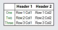
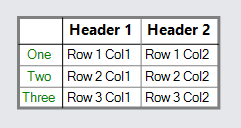
For example, if you want to treat the first row and the first column as "headers", you can separate them from the rest of the table by drawing a black line before row 1 and column 1.
  diagram.Add(
    new Part("Auto")
      .Add(
        new Shape { Fill = "white", Stroke = "gray", StrokeWidth = 3 },
        new Panel("Table")
          // drawn before row 1:
          .Add(new RowDefinition { Row = 1, SeparatorStrokeWidth = 1.5, SeparatorStroke = "black" })
          // drawn before column 1:
          .Add(new ColumnDefinition { Column = 1, SeparatorStrokeWidth = 1.5, SeparatorStroke = "black" })
          .Add(
            new TextBlock("Header 1")
              { Row = 0, Column = 1, Font = new Font("Segoe UI", 15, FontWeight.Bold), Margin = 2 },
            new TextBlock("Header 2")
              { Row = 0, Column = 2, Font = new Font("Segoe UI", 15, FontWeight.Bold), Margin = 2 },
            new TextBlock("One") { Row = 1, Column = 0, Stroke = "green", Margin = 2 },
            new TextBlock("Row 1 Col1") { Row = 1, Column = 1, Margin = 2 },
            new TextBlock("Row 1 Col2") { Row = 1, Column = 2, Margin = 2 },
            new TextBlock("Two") { Row = 2, Column = 0, Stroke = "green", Margin = 2 },
            new TextBlock("Row 2 Col1") { Row = 2, Column = 1, Margin = 2 },
            new TextBlock("Row 2 Col2") { Row = 2, Column = 2, Margin = 2 },
            new TextBlock("Three") { Row = 3, Column = 0, Stroke = "green", Margin = 2 },
            new TextBlock("Row 3 Col1") { Row = 3, Column = 1, Margin = 2 },
            new TextBlock("Row 3 Col2") { Row = 3, Column = 2, Margin = 2 }
          )
      )
  );
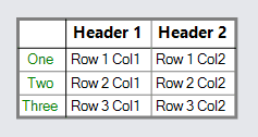
If you want to have a default separator between each row, set the default separator properties of the Panel. These properties are:
- Panel.DefaultSeparatorPadding
- Panel.DefaultRowSeparatorStrokeWidth
- Panel.DefaultRowSeparatorStroke
- Panel.DefaultRowSeparatorDashArray
- Panel.DefaultColumnSeparatorStrokeWidth
- Panel.DefaultColumnSeparatorStroke
- Panel.DefaultColumnSeparatorDashArray
Any separator properties set on a particular Row or ColumnDefinition will take precedence over the default values provided on the Panel. This permits keeping the special black line separating the header row and header column from the rest.
  diagram.Add(
    new Part("Auto")
      .Add(
        new Shape { Fill = "white", Stroke = "gray", StrokeWidth = 3 },
        new Panel("Table") {
            // Set defaults for all rows and columns:
            DefaultRowSeparatorStroke = "gray",
            DefaultColumnSeparatorStroke = "gray"
          }
          .Add(new RowDefinition { Row = 1, SeparatorStrokeWidth = 1.5, SeparatorStroke = "black" })
          .Add(new ColumnDefinition { Column = 1, SeparatorStrokeWidth = 1.5, SeparatorStroke = "black" })
          .Add(
            new TextBlock("Header 1") { Row = 0, Column = 1, Font = new Font("Segoe UI", 15, FontWeight.Bold), Margin = 2 },
            new TextBlock("Header 2") { Row = 0, Column = 2, Font = new Font("Segoe UI", 15, FontWeight.Bold), Margin = 2 },
            new TextBlock("One") { Row = 1, Column = 0, Stroke = "green", Margin = 2 },
            new TextBlock("Row 1 Col1") { Row = 1, Column = 1, Margin = 2 },
            new TextBlock("Row 1 Col2") { Row = 1, Column = 2, Margin = 2 },
            new TextBlock("Two") { Row = 2, Column = 0, Stroke = "green", Margin = 2 },
            new TextBlock("Row 2 Col1") { Row = 2, Column = 1, Margin = 2 },
            new TextBlock("Row 2 Col2") { Row = 2, Column = 2, Margin = 2 },
            new TextBlock("Three") { Row = 3, Column = 0, Stroke = "green", Margin = 2 },
            new TextBlock("Row 3 Col1") { Row = 3, Column = 1, Margin = 2 },
            new TextBlock("Row 3 Col2") { Row = 3, Column = 2, Margin = 2 }
          )
      )
  );
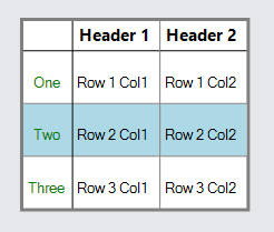
Row and ColumnDefinitions also have RowDefinition.SeparatorPadding and ColumnDefinition.SeparatorPadding properties, which can be used to add extra space to rows or columns. When a RowDefinition.Background or ColumnDefinition.Background is set, it includes the padding in its area.
  diagram.Add(
    new Part("Auto")
      .Add(
        new Shape { Fill = "white", Stroke = "gray", StrokeWidth = 3 },
        new Panel("Table") {
            // Set defaults for all rows and columns:
            Padding = 1.5,
            DefaultRowSeparatorStroke = "gray",
            DefaultColumnSeparatorStroke = "gray",
            DefaultSeparatorPadding = new Margin(18, 0, 8, 0)
          }
          .Add(
            // Override the panel's default padding on the first row
            new RowDefinition { Row = 0, SeparatorPadding = 0 },
            new RowDefinition { Row = 1, SeparatorStrokeWidth = 1.5, SeparatorStroke = "black" },
            new RowDefinition { Row = 2, Background = "lightblue" }
          )
          .Add(new ColumnDefinition { Column = 1, SeparatorStrokeWidth = 1.5, SeparatorStroke = "black" })
          .Add(
            new TextBlock("Header 1") { Row = 0, Column = 1, Font = new Font("Segoe UI", 15, FontWeight.Bold), Margin = 2 },
            new TextBlock("Header 2") { Row = 0, Column = 2, Font = new Font("Segoe UI", 15, FontWeight.Bold), Margin = 2 },
            new TextBlock("One") { Row = 1, Column = 0, Stroke = "green", Margin = 2 },
            new TextBlock("Row 1 Col1") { Row = 1, Column = 1, Margin = 2 },
            new TextBlock("Row 1 Col2") { Row = 1, Column = 2, Margin = 2 },
            new TextBlock("Two") { Row = 2, Column = 0, Stroke = "green", Margin = 2 },
            new TextBlock("Row 2 Col1") { Row = 2, Column = 1, Margin = 2 },
            new TextBlock("Row 2 Col2") { Row = 2, Column = 2, Margin = 2 },
            new TextBlock("Three") { Row = 3, Column = 0, Stroke = "green", Margin = 2 },
            new TextBlock("Row 3 Col1") { Row = 3, Column = 1, Margin = 2 },
            new TextBlock("Row 3 Col2") { Row = 3, Column = 2, Margin = 2 }
          )
      )
  );
TableRows and TableColumns
To avoid having to specify the row for each object, you can make use of a special Panel that can only be used in Table Panels, the PanelLayoutTableRow panel type. Put all of the objects for each row into a TableRow Panel. You will still need to specify the column for each object in each row.
  diagram.Add(
    new Part("Auto")
      .Add(
        new Shape { Fill = "white", Stroke = "gray", StrokeWidth = 3 },
        new Panel("Table") {
            // Set defaults for all rows and columns:
            DefaultRowSeparatorStroke = "gray",
            DefaultColumnSeparatorStroke = "gray"
          }
          .Add(new RowDefinition { Row = 1, SeparatorStrokeWidth = 1.5, SeparatorStroke = "black" })
          .Add(new ColumnDefinition { Column = 1, SeparatorStrokeWidth = 1.5, SeparatorStroke = "black" })
          .Add(
            new Panel("TableRow") { Row = 0 }
              .Add(
                new TextBlock("Header 1") { Column = 1, Font = new Font("Segoe UI", 15, FontWeight.Bold), Margin = 2 },
                new TextBlock("Header 2") { Column = 2, Font = new Font("Segoe UI", 15, FontWeight.Bold), Margin = 2 }
              ),
            new Panel("TableRow") { Row = 1 }
              .Add(
                new TextBlock("One") { Column = 0, Stroke = "green", Margin = 2 },
                new TextBlock("Row 1 Col1") { Column = 1, Margin = 2 },
                new TextBlock("Row 1 Col2") { Column = 2, Margin = 2 }
              ),
            new Panel("TableRow") { Row = 2 }
              .Add(
                new TextBlock("Two") { Column = 0, Stroke = "green", Margin = 2 },
                new TextBlock("Row 2 Col1") { Column = 1, Margin = 2 },
                new TextBlock("Row 2 Col2") { Column = 2, Margin = 2 }
              ),
            new Panel("TableRow") { Row = 3 }
              .Add(
                new TextBlock("Three") { Column = 0, Stroke = "green", Margin = 2 },
                new TextBlock("Row 3 Col1") { Column = 1, Margin = 2 },
                new TextBlock("Row 3 Col2") { Column = 2, Margin = 2 }
              )
          )
      )
  );
The same kind of organization is also possible with columns by using PanelLayoutTableColumn Panels.
Examples
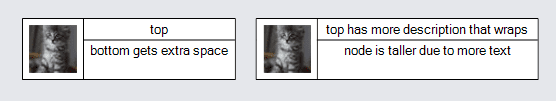
In this example the first column spans two rows, because GraphObject.RowSpan is 2 on the Picture.
The second column (column #1) has a ColumnDefinition.MinWidth of 100, so that column is at least that wide even if the elements in that column's cells are narrower.
The first column only takes as much width as it naturally needs and any excess width is given to the second column. This occurs because the ColumnDefinition for column #0 has ColumnDefinition.Sizing set to None. The same is true for the first row -- any extra height is given to the second row.
There is a column separator line just before the second column, and there is a row separator just before the second row because the RowDefinition.SeparatorStroke and ColumnDefinition.SeparatorStroke properties have been set to a color. But the row separator is not visible in the first column because that column's definition sets ColumnDefinition.Background to "white" and sets ColumnDefinition.CoversSeparators to true.
  diagram.NodeTemplate =
    new Node("Auto") { Resizable = true, MinSize = new Size(162, 62) }
      .Add(
        new Shape { Fill = "white" },
        new Panel("Table") { Stretch = Stretch.Fill, Margin = .5 }
          .Add(
            new ColumnDefinition
              { Column = 0, Sizing = Sizing.None, Background = "white", CoversSeparators = true },
            new ColumnDefinition
              { Column = 1, MinWidth = 100, Background = "white", SeparatorStroke = "black" }
          )
          .Add(
            new RowDefinition { Row = 0, Sizing = Sizing.None },
            new RowDefinition { Row = 1, SeparatorStroke = "black" }
          )
          .Add(
            new Picture { Row = 0, Column = 0, RowSpan = 2, Width = 48, Height = 48, Margin = 6 }
              .Bind("Source", "Pic"),
            new TextBlock
              { Row = 0, Column = 1, Stretch = Stretch.Horizontal, Margin = 2, TextAlign = TextAlign.Center }
              .Bind("Text", "Text1"),
            new TextBlock
              { Row = 1, Column = 1, Stretch = Stretch.Fill, Margin = 2, TextAlign = TextAlign.Center }
              .Bind("Text", "Text2")
          )
      );

  diagram.Model = new MyModel {
    NodeDataSource = new List<NodeData> {
      new NodeData {
        Pic = "Images/55x55.png",
        Text1 = "top",
        Text2 = "bottom gets extra space"
      },
      new NodeData {
        Pic = "Images/55x55.png",
        Text1 = "top has more description that wraps",
        Text2 = "node is taller due to more text"
      }
    }
  };