Panels
Panels are GraphObjects that hold other GraphObjects as their elements. A Panel is responsible for sizing and positioning all of its elements. Each Panel establishes its own coordinate system. The elements of a panel are drawn in order, thereby establishing the Z-ordering of those elements.
Although there is only one Panel class, there are many different kinds of panels, each with its own purpose in how it arranges its elements. When you construct a Panel you usually specify its Panel.Type as the constructor argument. These are the kinds of panels that exist:
- PanelLayoutPosition
- PanelLayoutVertical
- PanelLayoutHorizontal
- PanelLayoutAuto
- PanelLayoutSpot
- PanelLayoutTable (see the next section about Table Panels)
- PanelLayoutViewbox
- PanelLayoutLink (see the section about Link Labels)
- PanelLayoutGrid (see the section about Grid Patterns)
- PanelLayoutGraduated (see the section about Graduated Panels)
In these simplistic demonstrations, the code programmatically creates a Part and adds it to the Diagram. Once you learn about models and data binding you will generally not create parts programmatically.
Note also that one can only add Parts (i.e. Nodes and Links) to Diagrams, and that a Part cannot be an element of a Panel. But all Parts are Panels because the Part class inherits from Panel -- Parts are basically "top-level" Panels. Thus these examples make use of Parts as top-level objects whereas within a Node you would use a Panel instead of a Part.
Panels have no visual elements of their own, so to display their size the GraphObject.Background is often used. Panels also have Panel.Padding in addition to GraphObject.Margin. Unlike margin, backgrounds cover padding. Setting a padding when the Panel is constrained in size will reduce the total area that it has to arrange its elements. Setting a margin will not do this -- instead the Panel will expand in size.
Position Panels
The simplest kind of Panel is "Position" (PanelLayoutPosition). Each element gets its normal size, whether its natural size or a specified GraphObject.DesiredSize (or equivalently the GraphObject.Width and GraphObject.Height).
Each element's position is given by the GraphObject.Position property. If no position is specified, the element is positioned at (0,0). All positions are in the Panel's own coordinate system, not in the document-wide coordinate system. Positions may include negative coordinates.
The Panel's size is just big enough to hold all of its elements. If you want it to be a bit bigger than that, you can set the Panel.Padding property.
  diagram.Add(
    // all Parts are Panels
    new Part(PanelType.Position) // or "Position", or PanelLayoutPosition.Instance
      { Background = "lightgray" }
      .Add(
        new TextBlock("default, at (0, 0)") { Background = "lightgreen" },
        new TextBlock("(100, 0)") { Position = new Point(100, 0), Background = "lightgreen" },
        new TextBlock("(0, 100)") { Position = new Point(0, 100), Background = "lightgreen" },
        new TextBlock("(55, 28)") { Position = new Point(55, 28), Background = "lightgreen" },
        new TextBlock("(33, 70)") { Position = new Point(33, 70), Background = "lightgreen" },
        new TextBlock("(100, 100)") { Position = new Point(100, 100), Background = "lightgreen" }
      )
  );
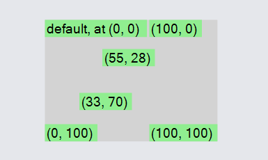
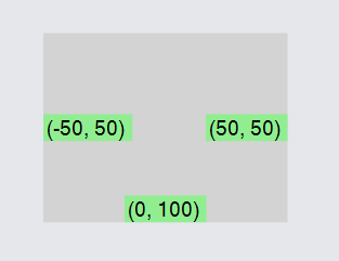
A Position Panel will always include the (0,0) origin point in its own panel coordinate system. Thus a Position Panel that has elements whose collective bounds does not include (0,0) is always extended to include the origin.
  diagram.Add(
    new Part("Position") { Background = "lightgray" }
      .Add(
        new TextBlock("(-50, 50)") { Position = new Point(-50, 50), Background = "lightgreen" },
        new TextBlock("(50, 50)") { Position = new Point(50, 50), Background = "lightgreen" },
        new TextBlock("(0, 100)") { Position = new Point(0, 100), Background = "lightgreen" }
      )
  );
Note that when you position Shapes within a Position Panel the thickness of their strokes, Shape.StrokeWidth, will be included. If you wish to position multiple Shapes so that their geometries line up with each other, independent of how thick their strokes are, set Shape.IsGeometryPositioned to true on each of those Shapes.
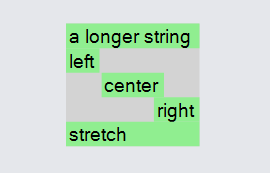
Vertical Panels
A very common kind of Panel is "Vertical" (PanelLayoutVertical). In this Panel all of the panel elements are arranged vertically from top to bottom. Each element gets its normal height and either its normal width or, if stretched, the width of the panel. If the element's GraphObject.Stretch property has any vertical stretch component, it is ignored.
If the element's width does not happen to be the same as the width of the Panel, it is aligned horizontally according to its GraphObject.Alignment property.
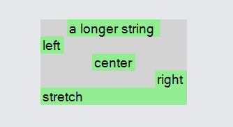
The following Vertical Panel shows how narrow objects are aligned horizontally and how a narrow object may be stretched horizontally. The width of the whole Panel is determined by the width of the widest object, which in this case is the first element. Note how the last element does not set the desired GraphObject.Width property, so that the GraphObject.Stretch value is effective.
  diagram.Add(
    new Part("Vertical") { Background = "lightgray" }
      .Add(
        new TextBlock("a longer string") { Background = "lightgreen" },
        new TextBlock("left") { Background = "lightgreen", Alignment = Spot.Left },
        new TextBlock("center") { Background = "lightgreen", Alignment = Spot.Center },
        new TextBlock("right") { Background = "lightgreen", Alignment = Spot.Right },
        new TextBlock("stretch") { Background = "lightgreen", Stretch = Stretch.Fill }
      )
  );
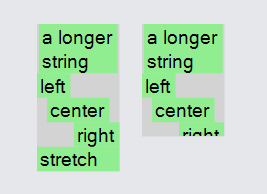
Constrained Width Vertical Panels
A Vertical Panel normally has the width of its widest element and the height that is the sum of all of its elements. However, you can also set the width and/or height to be larger or smaller than the natural size. Or if there is a Panel containing this PanelLayout it might impose size constraints on this panel. If the width and/or height are larger than the natural size, the panel is bigger, leaving empty space that may be filled with the background brush. If the width and/or height are smaller than the natural size, the content elements may be clipped.
The Vertical Panel below sets the width to be 140, much wider than needed. You can see how the last element's width is stretched.
  diagram.Add(
    new Part("Vertical") { Background = "lightgray", Width = 140 }
      .Add(
        new TextBlock("a longer string") { Background = "lightgreen" },
        new TextBlock("left") { Background = "lightgreen", Alignment = Spot.Left },
        new TextBlock("center") { Background = "lightgreen", Alignment = Spot.Center },
        new TextBlock("right") { Background = "lightgreen", Alignment = Spot.Right },
        new TextBlock("stretch") { Background = "lightgreen", Stretch = Stretch.Fill }
      )
  );
These two Vertical Panels both have a width of 55, much less than natural. The latter one also has a restricted height. Note how the text is automatically wrapped to try to fit within the limited width, because the default value for TextBlock.Wrap is to allow wrapping.
  diagram.Add(
    new Part("Vertical")
      { Position = new Point(0,0), Background = "lightgray", Width = 55 }
      .Add(
        new TextBlock("a longer string") { Background = "lightgreen" },
        new TextBlock("left") { Background = "lightgreen", Alignment = Spot.Left },
        new TextBlock("center") { Background = "lightgreen", Alignment = Spot.Center },
        new TextBlock("right") { Background = "lightgreen", Alignment = Spot.Right },
        new TextBlock("stretch") { Background = "lightgreen", Stretch = Stretch.Fill }
      )
  );
  diagram.Add(
    new Part("Vertical")
      { Position = new Point(70, 0), Background = "lightgray", Width = 55, Height = 75 }
      .Add(
        new TextBlock("a longer string") { Background = "lightgreen" },
        new TextBlock("left") { Background = "lightgreen", Alignment = Spot.Left },
        new TextBlock("center") { Background = "lightgreen", Alignment = Spot.Center },
        new TextBlock("right") { Background = "lightgreen", Alignment = Spot.Right },
        new TextBlock("stretch") { Background = "lightgreen", Stretch = Stretch.Fill }
      )
  );
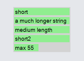
Here is a Vertical Panel with a default GraphObject.Stretch of Stretch.Horizontal. Because no width is specified for the whole PanelLayout its
width is the width of the widest element, in this case the second one. Note how all of the TextBlocks have the same long width, as highlighted by the
lightgreen backgrounds. However the last TextBlock has a limited width, so it is not stretched. One can limit the width but not the height by supplying a
value of NaN or Infinity for the height.
  diagram.Add(
    new Part("Vertical")
      { Background = "lightgray", DefaultStretch = Stretch.Horizontal }
      .Add(
        new TextBlock("short") { Margin = 2, Background = "lightgreen" },
        new TextBlock("a much longer string") { Margin = 2, Background = "lightgreen" },
        new TextBlock("medium length") { Margin = 2, Background = "lightgreen" },
        new TextBlock("short2") { Margin = 2, Background = "lightgreen" },
        new TextBlock("max 55") { Margin = 2, Background = "lightgreen", MaxSize = new Size(55, double.NaN) }
      )
  );
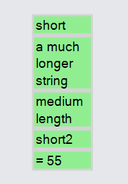
If you change that sample to set the GraphObject.Width or GraphObject.DesiredSize.Width on one or more of the elements (just the last one in this case), the panel will get a width that is equal to the maximum of the set widths. The reduced width will cause the other, stretched, elements to be measured with the limited width (55 in this case), which cause those TextBlocks to wrap to fit within the available width.
  diagram.Add(
    new Part("Vertical") { Background = "lightgray", DefaultStretch = Stretch.Horizontal }
      .Add(
        new TextBlock("short") { Margin = 2, Background = "lightgreen" },
        new TextBlock("a much longer string") { Margin = 2, Background = "lightgreen" },
        new TextBlock("medium length") { Margin = 2, Background = "lightgreen" },
        new TextBlock("short2") { Margin = 2, Background = "lightgreen" },
        new TextBlock("= 55") { Margin = 2, Background = "lightgreen", Width = 55 }
      )
  );
Horizontal Panels
Horizontal Panels are just like Vertical Panels, except that the elements are arranged horizontally instead of vertically. Elements are never stretched horizontally, but they may be stretched vertically. Because elements are never stretched horizontally, a stretch value of Stretch.Fill is the same as Stretch.Vertical.
Note that the last element in both panels do not specify a desired GraphObject.Height, so that the GraphObject.Stretch value may be effective.
  diagram.Add(
    new Part("Horizontal")
      { Position = new Point(0, 0), Background = "lightgray" }
      .Add(
        new Shape { Width = 30, Fill = "lightgreen", Height = 100 },
        new Shape { Width = 30, Fill = "lightgreen", Height = 50, Alignment = Spot.Top },
        new Shape { Width = 30, Fill = "lightgreen", Height = 50, Alignment = Spot.Center },
        new Shape { Width = 30, Fill = "lightgreen", Height = 50, Alignment = Spot.Bottom },
        new Shape { Width = 30, Fill = "lightgreen", Stretch = Stretch.Fill }
      )
  );
  diagram.Add(
    new Part("Horizontal")
      { Position = new Point(200, 0), Background = "lightgray", Height = 120 }
      .Add(
        new Shape { Width = 30, Fill = "lightgreen", Height = 50, Alignment = Spot.Top },
        new Shape { Width = 30, Fill = "lightgreen", Height = 50, Alignment = Spot.Center },
        new Shape { Width = 30, Fill = "lightgreen", Height = 50, Alignment = Spot.Bottom },
        new Shape { Width = 30, Fill = "lightgreen", Stretch = Stretch.Fill }
      )
  );
Filling Horizontal and Vertical Panels in Opposite Direction
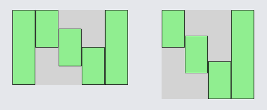
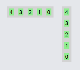
Both Vertical and Horizontal Panels can have their elements be arranged in the opposite direction: bottom-to-top for Vertical Panels and right-to-left for Horizontal Panels. Just set Panel.IsOpposite to true.
  diagram.Add(
    new Part("Horizontal")
      { Background = "lightgray", IsOpposite = true }
      .Add(
        new TextBlock("0") { Margin = 5, Background = "lightgreen" },
        new TextBlock("1") { Margin = 5, Background = "lightgreen" },
        new TextBlock("2") { Margin = 5, Background = "lightgreen" },
        new TextBlock("3") { Margin = 5, Background = "lightgreen" },
        new TextBlock("4") { Margin = 5, Background = "lightgreen" }
      )
  );
  diagram.Add(
    new Part("Vertical")
      { Background = "lightgray", IsOpposite = true }
      .Add(
        new TextBlock("0") { Margin = 5, Background = "lightgreen" },
        new TextBlock("1") { Margin = 5, Background = "lightgreen" },
        new TextBlock("2") { Margin = 5, Background = "lightgreen" },
        new TextBlock("3") { Margin = 5, Background = "lightgreen" },
        new TextBlock("4") { Margin = 5, Background = "lightgreen" }
      )
  );
Default Alignment and Stretch
Both Vertical and Horizontal Panels support the Panel.DefaultAlignment and Panel.DefaultStretch properties. This is a convenience so that you do not need to set the GraphObject.Alignment or GraphObject.Stretch property on each element.
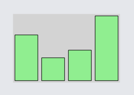
Here is a Horizontal Panel with a default GraphObject.Alignment of Spot.Bottom. All of the Shapes are aligned at the bottom, even though the default alignment would normally be Spot.Center. However, the last Shape has its height stretched to the full height of the Panel, 90. In this case the GraphObject.Margin provides a little extra space around the object.
  diagram.Add(
    new Part("Horizontal")
      { Background = "lightgray", Height = 90, DefaultAlignment = Spot.Bottom }
      .Add(
        new Shape { Width = 30, Margin = 2, Fill = "lightgreen", Height = 60 },
        new Shape { Width = 30, Margin = 2, Fill = "lightgreen", Height = 30 },
        new Shape { Width = 30, Margin = 2, Fill = "lightgreen", Height = 40 },
        new Shape { Width = 30, Margin = 2, Fill = "lightgreen", Stretch = Stretch.Fill }
      )
  );
Vertical and Horizontal Panels are relatively simple ways of arranging a column or a row of objects. For more options, you may need to use a Table Panel, even with the same set of objects. This is especially true when you want more control over the stretching of one or more elements.
Spots
Before we discuss other kinds of Panels, we should elaborate a bit about the concept of spots. Spots are a way of providing both relative and absolute positioning information.
You have already seen many of the most common uses of Spots, for specifying the alignment of objects within a Panel, as constant values of the Spot class:
| Spot.TopLeft | Spot.Top | Spot.TopRight |
| Spot.Left | Spot.Center | Spot.Right |
| Spot.BottomLeft | Spot.Bottom | Spot.BottomRight |
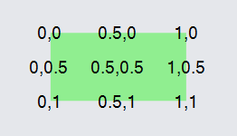
But Spots are more general than that. The Spot.X and Spot.Y properties can be any number between zero and one, inclusive. Those values are the fractional distances along the X and Y axes from the top-left corner of an arbitrary rectangle. So Spot.TopLeft is the same as new Spot(0, 0), Spot.BottomRight is the same as new Spot(1, 1), and Spot.Right is the same as new Spot(1, 0.5).
Here are the standard nine Spots shown on a rectangular shape.
  diagram.Add(
    new Part("Spot")
      .Add(
        new Shape("Rectangle") { Fill = "lightgreen", Stroke = null, Width = 100, Height = 50 },
        new TextBlock("0,0") { Alignment = new Spot(0, 0) },
        new TextBlock("0.5,0") { Alignment = new Spot(0.5, 0) },
        new TextBlock("1,0") { Alignment = new Spot(1, 0) },
        new TextBlock("0,0.5") { Alignment = new Spot(0, 0.5) },
        new TextBlock("0.5,0.5") { Alignment = new Spot(0.5, 0.5) },
        new TextBlock("1,0.5") { Alignment = new Spot(1, 0.5) },
        new TextBlock("0,1") { Alignment = new Spot(0, 1) },
        new TextBlock("0.5,1") { Alignment = new Spot(0.5, 1) },
        new TextBlock("1,1") { Alignment = new Spot(1, 1) }
      )
  );
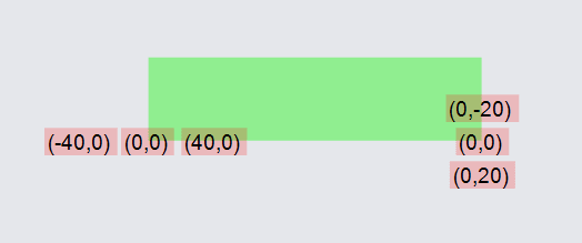
Besides the fractional positioning of a spot relative to some rectangular area, you can also specify an absolute offset. The Spot.OffsetX and Spot.OffsetY properties determine a point that is a distance from the fractional point given by Spot.X and Spot.Y. Here we show three TextBlocks near the bottom-left corner and three TextBlocks near the bottom-right corner. The ones on the left are offset along the X-axis plus or minus 40 units; the ones on the right are offset along the Y-axis plus or minus 20 units. TextBlocks are also given a semi-transparent red background to help distinguish their bounds.
  var pink = "rgba(255,0,0,.2)";
  diagram.Add(
    new Part("Spot")
      .Add(
        new Shape("Rectangle") { Fill = "lightgreen", Stroke = null, Width = 200, Height = 50 },
        // Near bottom-left corner:
        new TextBlock("-40,0") { Background = pink, Alignment = new Spot(0, 1, -40, 0) },
        new TextBlock("0,0") { Background = pink, Alignment = new Spot(0, 1, 0, 0) },
        new TextBlock("40,0") { Background = pink, Alignment = new Spot(0, 1, 40, 0) },
        // Near bottom-right corner:
        new TextBlock("0,-20") { Background = pink, Alignment = new Spot(1, 1, 0, -20) },
        new TextBlock("0,0") { Background = pink, Alignment = new Spot(1, 1, 0, 0) },
        new TextBlock("0,20") { Background = pink, Alignment = new Spot(1, 1, 0, 20) }
      )
  );
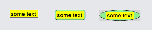
Auto Panels
Auto Panels fit a "main" element just around the other elements of the panel. The main element is usually the furthest back in the Z-order, i.e. the first element, so that the other elements are not obscured by it. The main element is declared by setting GraphObject.IsPanelMain to true; but often no such element is present, so it uses the very first element of the panel.
Typically the Auto Panel will measure the non-"main" elements, determine a width and a height that can enclose all of them, and make the "main" element that size or slightly bigger. You do not set the GraphObject.DesiredSize (or GraphObject.Width or GraphObject.Height) of the "main" element.
An Auto Panel is the normal way to implement a border around an object. Use a Shape as the first/"main" element -- it becomes the border. The Shape.Figure is normally "Rectangle" or "RoundedRectangle" or "Ellipse", as shown below. The other elements become the "content" for the panel inside the border. In the examples below there is only a single "content" element, a TextBlock. We have set the GraphObject.Background and Shape.Fill properties to help show the sizes and positions of objects.
Auto Panels should have two or more elements in them.
  diagram.Add(
    new Part("Auto")
      { Position = new Point(0, 0), Background = "lightgray" }
      .Add(
        new Shape("Rectangle") { Fill = "lightgreen" },
        new TextBlock("some text") {  Background = "yellow" }
      )
  );
  diagram.Add(
    new Part("Auto")
      { Position = new Point(100, 0), Background = "lightgray" }
      .Add(
        new Shape("RoundedRectangle") { Fill = "lightgreen" },
        new TextBlock("some text") { Background = "yellow" }
      )
  );
  diagram.Add(
    new Part("Auto")
      { Position = new Point(200, 0), Background = "lightgray" }
      .Add(
        new Shape("Ellipse") { Fill = "lightgreen" },
        new TextBlock("some text") { Background = "yellow" }
      )
  );
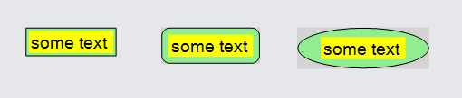
If you add a GraphObject.Margin to the TextBlock in each of the same three panels, you will add a little space all around the "content" element inside the "main" element.
  diagram.Add(
    new Part("Auto")
      { Position = new Point(0, 0), Background = "lightgray" }
      .Add(
        new Shape("Rectangle") { Fill = "lightgreen" },
        new TextBlock("some text") { Margin = 2, Background = "yellow" }
      )
  );
  diagram.Add(
    new Part("Auto")
      { Position = new Point(100, 0), Background = "lightgray" }
      .Add(
        new Shape("RoundedRectangle") { Fill = "lightgreen" },
        new TextBlock("some text") { Margin = 2, Background = "yellow" }
      )
  );
  diagram.Add(
    new Part("Auto")
      { Position = new Point(200, 0), Background = "lightgray" }
      .Add(
        new Shape("Ellipse") { Fill = "lightgreen" },
        new TextBlock("some text") { Margin = 2, Background = "yellow" }
      )
  );
For most Shapes other than "Rectangle" figure we do not want to have the "main" shape be the same size as the "content" element. Ellipses, for example, need to be significantly larger than the content to avoid having the content spill over the edge of the shape. This can be controlled by setting the Shape.Spot1 and Shape.Spot2 properties, which determine the area where the content should go. Many of the predefined figures have their own default values for Spot1 and Spot2.
  diagram.Add(
    new Part("Auto")
      { Position = new Point(0, 0), Background = "lightgray" }
      .Add(
        new Shape("RoundedRectangle")
          { Fill = "lightgreen", Spot1 = new Spot(0, 0), Spot2 = new Spot(1, 1) },
        new TextBlock("some text") { Background = "yellow" }
      )
  );
  diagram.Add(
    new Part("Auto")
      { Position = new Point(100, 0), Background = "lightgray" }
      .Add(
        new Shape("RoundedRectangle")
          { Fill = "lightgreen", Spot1 = new Spot(0, 0, 10, 0), Spot2 = new Spot(1, 1, -10, -10) },
        new TextBlock("some text") { Background = "yellow" }
      )
  );
  diagram.Add(
    new Part("Auto")
      { Position = new Point(200, 0), Background = "lightgray" }
      .Add(
        new Shape("RoundedRectangle")
          { Fill = "lightgreen", Spot1 = new Spot(0, 0, 0, 20), Spot2 = new Spot(1, 1, 0, -20) },
        new TextBlock("some text") { Background = "yellow" }
      )
  );
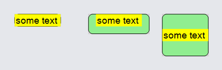
The Spot1 and Spot2 properties on the main Shape are more general and more flexible than specifying the GraphObject.Margin on the content element(s).
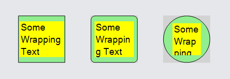
Constrained Size Auto Panels
If you constrain the size of the whole Panel, there may be less or more space available to fit all of the "content" elements inside the "main" element. If an element has a size that won't fit in the available area, it will be clipped. That also applies to the main element -- you normally should not set its GraphObject.DesiredSize or GraphObject.Width or GraphObject.Height, because that will cause it too to be clipped (if too big) or to not act as a proper border around the other elements of the panel (if too small).
In the following example each Part has a total size of 65x65, causing the "content" TextBlocks to be limited in width and height, less than the natural width, which results in wrapping of the text. However there may not be enough height available to show the whole content element(s), causing them to be clipped. You can see that in the third Part the text is clipped, because there is less available area within an ellipse than within a rectangle.
  diagram.Add(
    new Part("Auto") {
        Width = 65, Height = 65,  // set the size of the whole panel
        Position = new Point(0, 0), Background = "lightgray"
      }
      .Add(
        new Shape("Rectangle") { Fill = "lightgreen" },
        new TextBlock("Some Wrapping Text") { Background = "yellow" }
      )
  );
  diagram.Add(
    new Part("Auto") {
        Width = 65, Height = 65,  // set the size of the whole panel
        Position = new Point(100, 0), Background = "lightgray"
      }
      .Add(
        new Shape("RoundedRectangle") { Fill = "lightgreen" },
        new TextBlock("Some Wrapping Text") { Background = "yellow" }
      )
  );
  diagram.Add(
    new Part("Auto") {
        Width = 65, Height = 65,  // set the size of the whole panel
        Position = new Point(200, 0), Background = "lightgray"
      }
      .Add(
        new Shape("Ellipse") { Fill = "lightgreen" },
        new TextBlock("Some Wrapping Text") { Background = "yellow" }
      )
  );
You should not set the size (GraphObject.DesiredSize or GraphObject.Width or GraphObject.Height) of the "main" element of an Auto Panel.
Auto Panels should have two or more elements in them.
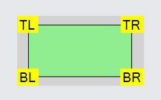
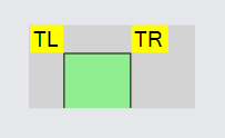
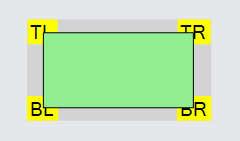
Spot Panels
Spot Panels are like Auto Panels in that there is a "main" element and there are "other" elements that are not resized. The "other" elements are positioned about the "main" element based on the GraphObject.Alignment property that has a Spot value. The main feature of Spot Panels, unlike Auto Panels, is that those elements may extend beyond the bounds of the "main" element.
This is useful for having the main shape be a specific size and positioning smaller elements at particular places relative to the main shape. Note in this example that the TextBlocks are centered at the four corners, causing the panel to be larger than the main shape, as can be seen with the light gray background.
Spot Panels should have two or more elements in them.
  diagram.Add(
    new Part("Spot") { Background = "lightgray" }
      .Add(
        new Shape("Rectangle") { Fill = "lightgreen", Width = 100, Height = 50 },
        new TextBlock("TL") { Background = "yellow", Alignment = Spot.TopLeft },
        new TextBlock("TR") { Background = "yellow", Alignment = Spot.TopRight },
        new TextBlock("BL") { Background = "yellow", Alignment = Spot.BottomLeft },
        new TextBlock("BR") { Background = "yellow", Alignment = Spot.BottomRight }
      )
  );
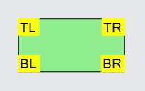
A Spot Panel aligns its content elements in the general location given by its GraphObject.Alignment. The precise point in the content element that is positioned defaults to Spot.Center, as seen above. But you can set the element's GraphObject.AlignmentFocus to use a different spot. For example, if you use the same AlignmentFocus as the Alignment, the elements will be just inside the main element's bounds:
  diagram.Add(
    new Part("Spot") { Background = "lightgray" }
      .Add(
        new Shape("Rectangle") { Fill = "lightgreen", Width = 100, Height = 50 },
        new TextBlock("TL")
          { Background = "yellow", Alignment = Spot.TopLeft, AlignmentFocus = Spot.TopLeft },
        new TextBlock("TR")
          { Background = "yellow", Alignment = Spot.TopRight, AlignmentFocus = Spot.TopRight },
        new TextBlock("BL")
          { Background = "yellow", Alignment = Spot.BottomLeft, AlignmentFocus = Spot.BottomLeft },
        new TextBlock("BR")
          { Background = "yellow", Alignment = Spot.BottomRight, AlignmentFocus = Spot.BottomRight }
      )
  );
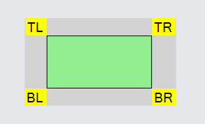
If you use the opposite AlignmentFocus as the Alignment, the elements will be just outside the main element's bounds:
  diagram.Add(
    new Part("Spot") { Background = "lightgray" }
      .Add(
        new Shape("Rectangle") { Fill = "lightgreen", Width = 100, Height = 50 },
        new TextBlock("TL")
          { Background = "yellow", Alignment = Spot.TopLeft, AlignmentFocus = Spot.BottomRight },
        new TextBlock("TR")
          { Background = "yellow", Alignment = Spot.TopRight, AlignmentFocus = Spot.BottomLeft },
        new TextBlock("BL")
          { Background = "yellow", Alignment = Spot.BottomLeft, AlignmentFocus = Spot.TopRight },
        new TextBlock("BR")
          { Background = "yellow", Alignment = Spot.BottomRight, AlignmentFocus = Spot.TopLeft }
      )
  );
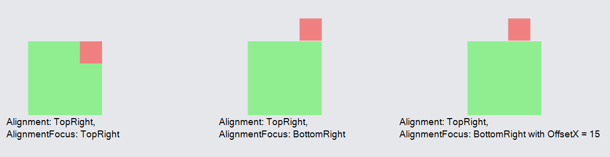
AlignmentFocus OffsetX/Y will also work to offset the AlignmentFocus point, the same way it works for Link labels:
  diagram.Layout = new GridLayout {
    WrappingColumn = 10, WrappingWidth = 1200,
    IsViewportSized = false
  };

  diagram.Add(
    new Part("Vertical") {  LocationElementName = "MAIN" }
      .Add(
        new Panel("Spot")
          .Add(
            new Shape { Name = "MAIN", Fill = "lightgreen", Stroke = null },
            new Shape {
              Fill = "lightcoral", Stroke = null, Width = 30, Height = 30,
              Alignment = Spot.TopRight, AlignmentFocus = Spot.TopRight
            }
          ),
        new TextBlock("Alignment: TopRight,\nAlignmentFocus: TopRight")
      )
  );

  diagram.Add(
    new Part("Vertical") { LocationElementName = "MAIN" }
      .Add(
        new Panel("Spot")
          .Add(
            new Shape { Name = "MAIN", Fill = "lightgreen", Stroke = null },
            new Shape {
              Fill = "lightcoral", Stroke = null, Width = 30, Height = 30,
              Alignment = Spot.TopRight, AlignmentFocus = Spot.BottomRight
            }
          ),
        new TextBlock("Alignment: TopRight,\nAlignmentFocus: BottomRight")
      )
  );

  diagram.Add(
    new Part("Vertical") { LocationElementName = "MAIN" }
      .Add(
        new Panel("Spot")
          .Add(
            new Shape { Name = "MAIN", Fill = "lightgreen", Stroke = null },
            new Shape {
              Fill = "lightcoral", Stroke = null, Width = 30, Height = 30,
              // BottomRight with OffsetX = 15
              Alignment = Spot.TopRight, AlignmentFocus = new Spot(1, 1, 15, 0)
            }
          ),
        new TextBlock("Alignment: TopRight,\nAlignmentFocus: BottomRight with OffsetX = 15")
      )
  );
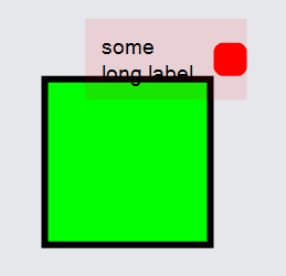
Aligning to sub-elements with Spot Panels
You may find it necessary to align an object nested inside a Spot panel with that panel's main element. This is often the case when you want an element of a Spot panel to appear to have its own text label or other decorator.
To do this, you can use Panel.AlignmentFocusName. In the example below, a Spot panel contains a main element and another Panel. We want to align the corners of the main element the shape within this Panel, so we give it a name and set alignmentFocusName on the panel.
  diagram.Add(
    new Part("Spot")
      .Add(
        // Main shape
        new Shape("Rectangle") { StrokeWidth = 4, Fill = "lime" },
        // Instead of aligning this Panel, we want to align the shape inside of it,
        // to the corner of the main shape
        new Panel("Horizontal")
          { Background = "rgba(255, 0, 0, .1)", AlignmentFocusName = "SHAPE", Alignment = Spot.TopRight, AlignmentFocus = Spot.BottomLeft }
          .Add(
            new TextBlock("some\nlong label") { Margin = 8 },
            new Shape("RoundedRectangle") {
              Width = 20, Height = 20,
              Name = "SHAPE",
              StrokeWidth = 0, Fill = "red"
            }
          )
      )
  );
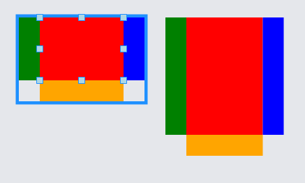
Stretching with Spot Panels
When a non-main element in a Spot panel stretches, it takes on the width and/or height of the main element. This can be useful for aligning elements within the Panel.
In the example below, the red main element has three elements around it which stretch to its side's length. The main element is the Part.ResizeElement, and as it changes size the stretched elements will change size accordingly.
  diagram.Add(
    new Part("Spot") { Resizable = true, ResizeElementName = "MAIN" }
      .Add(
        new Shape { Name = "MAIN", StrokeWidth = 0,Width = 80, Height = 60, Fill = "red" },

        new Shape {
          Stretch = Stretch.Vertical, StrokeWidth = 0, Width = 20, Fill = "green",
          Alignment = Spot.Left, AlignmentFocus = Spot.Right
        },
        new Shape {
          Stretch = Stretch.Vertical, StrokeWidth = 0, Width = 20, Fill = "blue",
          Alignment = Spot.Right, AlignmentFocus = Spot.Left
        },
        new Shape {
          Stretch = Stretch.Horizontal, StrokeWidth = 0, Height = 20, Fill = "orange",
          Alignment = Spot.Bottom, AlignmentFocus = Spot.Top
        }
      )
  );
  diagram.Select(diagram.Parts.First());
Constraining size with Spot Panels
If you constrain the size of the whole Panel, the panel may clip its elements. For example, when the whole panel must be 100x50, there is room horizontally but not vertically for the main element plus all of its other elements after arranging them.
  diagram.Add(
    new Part("Spot") { Background = "lightgray", Width = 100, Height = 50 }
      .Add(
        new Shape("Rectangle") { Fill = "lightgreen", Width = 40, Height = 40 },
        new TextBlock("TL") { Background = "yellow", Alignment = Spot.TopLeft, AlignmentFocus = Spot.BottomRight },
        new TextBlock("TR") { Background = "yellow", Alignment = Spot.TopRight, AlignmentFocus = Spot.BottomLeft },
        new TextBlock("BL") { Background = "yellow", Alignment = Spot.BottomLeft, AlignmentFocus = Spot.TopRight },
        new TextBlock("BR") { Background = "yellow", Alignment = Spot.BottomRight, AlignmentFocus = Spot.TopLeft }
      )
  );
Spot Panels should have two or more elements in them.
Remember that the elements of every panel are drawn in order. Normally you want the main element to be behind all of the other elements, so the main element will come first. However if you want the main element to be in front of some or all of the other elements, you can move the main element to not be the first element of the Panel, if you also set its GraphObject.IsPanelMain property to true.
  diagram.Add(
    new Part("Spot") { Background = "lightgray" }
      .Add(
        new TextBlock("TL") { Background = "yellow", Alignment = Spot.TopLeft },
        new TextBlock("TR") { Background = "yellow", Alignment = Spot.TopRight },
        new TextBlock("BL") { Background = "yellow", Alignment = Spot.BottomLeft },
        new TextBlock("BR") { Background = "yellow", Alignment = Spot.BottomRight },

        // NOTE: the main element isn't first, so it must be declared by setting IsPanelMain to true
        new Shape("Rectangle") {
          IsPanelMain = true,
          Fill = "lightgreen", Width = 100, Height = 50
        }
      )
  );
Note how the opaque Shape, explicitly declared to be the main element, is now visually in front of the non-main elements of the Spot Panel because it has been moved to be the last element in the panel.
Without setting GraphObject.IsPanelMain to true on the desired main element, in this example Panel.FindMainElement would return the first TextBlock. This would cause all of the other elements to be arranged around that TextBlock. Since the TextBlock is small and the rectangular Shape is big and opaque, the Shape would cover all of the other TextBlocks, so the user might not see any text, depending on the size and alignment of those other TextBlocks.
Clipping with Spot Panels
Spot Panels can set Panel.IsClipping to true to use the main Panel element as a clipping area instead of a drawn Shape. If used, the main element must be a Shape and its stroke and fill will not be drawn. When Panel.IsClipping is true, the Spot panel will size itself to be the intersection of the main element bounds and all other elements' bounds, rather than the union of these bounds.
Example:
  diagram.Layout = new GridLayout();

  // Without Panel.IsClipping
  diagram.Add(
    new Part("Spot") { Scale = 2 }
      .Add(
        new Shape("Circle") { Width = 55, StrokeWidth = 0 },
        new Picture("Images/55x55.png") { Width = 55, Height = 55 }
      )
  );

  // Using Panel.IsClipping
  diagram.Add(
    new Part("Spot") { IsClipping = true, Scale = 2 }
      .Add(
        new Shape("Circle") { Width = 55, StrokeWidth = 0 },
        new Picture("Images/55x55.png") { Width = 55, Height = 55 }
      )
  );

  // Using Panel.IsClipping and also having a surrounding panel
  diagram.Add(
    new Part("Spot") { Scale = 2 }
      .Add(
        new Shape("Circle") { Width = 65, StrokeWidth = 0, Fill = "red" },
        new Panel("Spot") { IsClipping = true }
          .Add(
            new Shape("Circle") { Width = 55, StrokeWidth = 0 },
            new Picture("Images/55x55.png") { Width = 55, Height = 55 }
          )
      )
  );

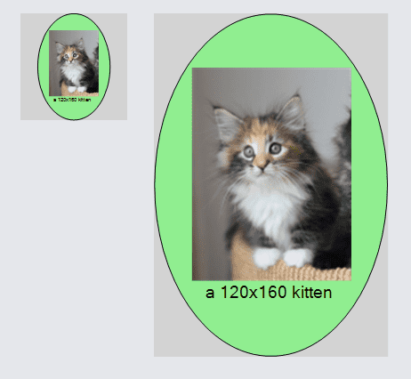
Viewbox Panels
Viewbox Panels contain only a single element that is rescaled to fit the size of the Panel.
This is useful for taking an arbitrary element, especially a Panel, and automatically squeezing it to fit in a small fixed-size area. The same can be achieved by setting the GraphObject.Scale on that element, but with a Viewbox Panel that computation is performed automatically.
In this diagram there are two copies of the same Auto Panel, each consisting of a Picture and a caption TextBlock surrounded by an Ellipse Shape. The one on the left is inside a Viewbox Panel forced to fit in an 80x80 area; the one on the right is its natural size. Note that you can still see all of the elements of the panel at a reduced scale so that it can fit inside the Viewbox panel. But because the nested panel is taller than it is wider, there is empty space on the sides of the 80x80 Viewbox.
  diagram.Add(
    new Part("Viewbox") {
        Position = new Point(0, 0), Background = "lightgray",
        Width = 80, Height = 80
      }
      .Add(
        new Panel("Auto")
          .Add(
            new Shape("Ellipse") { Fill = "lightgreen" },
            new Panel("Vertical")
              .Add(
                new Picture("Images/120x160.png"),
                new TextBlock("a 120x160 kitten")
              )
          )
      )
  );
  diagram.Add(
    new Part("Auto") { Position = new Point(100, 0), Background = "lightgray" }
      .Add(
        new Shape("Ellipse") { Fill = "lightgreen" },
        new Panel("Vertical")
          .Add(
            new Picture("Images/120x160.png"),
            new TextBlock("a 120x160 kitten")
          )
      )
  );