TextBlocks
Use the TextBlock class to display text.
Setting the TextBlock.Text property is the only way to show a text string. Because TextBlock inherits from GraphObject, some GraphObject properties will affect text. But there are additional text-only options regarding how that text is formatted and drawn.
In these simplistic demonstrations, the code programmatically creates a Part and adds it to the Diagram. Once you learn about models and data binding you will generally not create parts (nodes or links) programmatically.
Font and colors
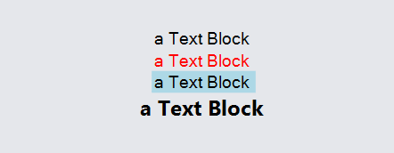
The size and stylistic appearance of the text is specified by the TextBlock.Font.
The text is drawn using the TextBlock.Stroke brush. The value may be a color string or a Brush. By default the stroke is "black".
You can also specify the brush to use as the background: GraphObject.Background. This defaults to no brush at all, which results in a transparent background. The background is always rectangular.
  diagram.Add(
    new Part("Vertical")
      .Add(
        new TextBlock { Text = "a Text Block" },
        new TextBlock { Text = "a Text Block", Stroke = "red" },
        new TextBlock { Text = "a Text Block", Background = "lightblue" },
        new TextBlock { Text = "a Text Block", Font = new Font("Segoe UI", 13, FontWeight.Bold) }
      )
  );
Sizing and Clipping
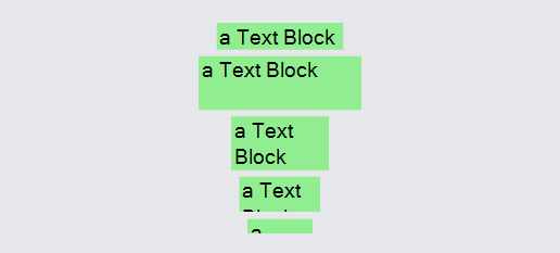
The natural size of a TextBlock is just big enough to render the text string with the given font. However the actual size of the TextBlock can be larger or smaller in either dimension. Larger dimensions result in areas with no text; smaller dimensions result in clipping.
To demonstrate this, the examples below start with a naturally sized TextBlock, followed by ones with decreasing explicit sizes. To better show the actual size of the TextBlocks below, we have given them lightgreen backgrounds.
  diagram.Add(
    new Part("Vertical")
      .Add(
        new TextBlock { Text = "a Text Block", Background = "lightgreen", Margin = 2 },
        new TextBlock {
          Text = "a Text Block", Background = "lightgreen", Margin = 2,
          Width = 100, Height = 33
        },
        new TextBlock {
          Text = "a Text Block", Background = "lightgreen", Margin = 2,
          Width = 60, Height = 33
        },
        new TextBlock {
          Text = "a Text Block", Background = "lightgreen", Margin = 2,
          Width = 50, Height = 22
        },
        new TextBlock {
          Text = "a Text Block", Background = "lightgreen", Margin = 2,
          Width = 40, Height = 9
        }
      )
  );
Max Lines and Overflow
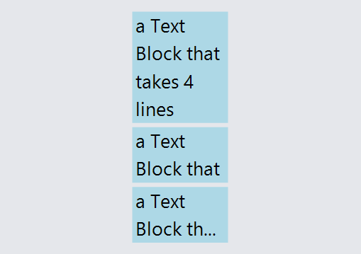
You can constrain the TextBlock's available size using GraphObject.DesiredSize (width and height), but you can also limit the vertical height with TextBlock.MaxLines, which will limit the number allowed. When there isn't enough space to display all text, you can decide how to use the remaining space with different values for TextBlock.Overflow. There are additional options in the wrapping section below.
The example below starts with a naturally sized TextBlock,
followed by ones with a max of 2 lines using the default TextBlock.Overflow value of OverflowClip,
followed by one using the TextBlock.Overflow value of OverflowEllipsis.
  diagram.Add(
    new Part("Vertical")
      .Add(
        // Allow any number of lines, no clipping needed:
        new TextBlock {
          Text = "a Text Block that takes 4 lines",
          Font = new Font("Segoe UI", 18),
          Background = "lightblue",
          Overflow = Overflow.Clip,  /* the default value */
          // No max lines
          Margin = 2,
          Width = 90
        },
        // Allow only 2 lines, OverflowClip:
        new TextBlock {
          Text = "a Text Block that takes 4 lines",
          Font = new Font("Segoe UI", 18),
          Background = "lightblue",
          Overflow = Overflow.Clip,  /* the default value */
          MaxLines = 2,
          Margin = 2,
          Width = 90
        },
        // Allow only 2 lines, OverflowEllipsis:
        new TextBlock {
          Text = "a Text Block that takes 4 lines",
          Font = new Font("Segoe UI", 18),
          Background = "lightblue",
          Overflow = Overflow.Ellipsis,
          MaxLines = 2,
          Margin = 2,
          Width = 90
        }
      )
  );
Wrapping
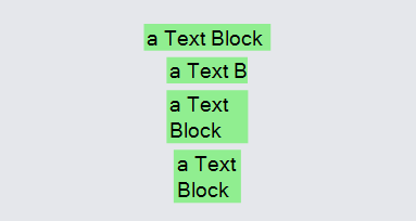
Text can also be automatically wrapped onto additional lines. In order for wrapping to happen, the TextBlock.Wrap property must not be None, and there must be some constraint on the width to be narrower than it would naturally be.
In the following examples, the first TextBlock gets its natural size, the second is limited to 50 wide but is not allowed to wrap, and the other examples are limited to the same width but are allowed to wrap.
  diagram.Add(
    new Part("Vertical")
      .Add(
        new TextBlock { Text = "a Text Block", Background = "lightgreen", Margin = 2 },
        new TextBlock {
          Text = "a Text Block", Background = "lightgreen", Margin = 2,
          Width = 50, Wrap = Wrap.None
        },
        new TextBlock {
          Text = "a Text Block", Background = "lightgreen", Margin = 2,
          Width = 50, Wrap = Wrap.DesiredSize
        },
        new TextBlock {
          Text = "a Text Block", Background = "lightgreen", Margin = 2,
          Width = 50, Wrap = Wrap.Fit
        }
      )
  );
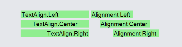
Text Alignment
The TextBlock.TextAlign property specifies where to draw the characters horizontally within the size of the TextBlock.
This is different than the GraphObject.Alignment property, which controls where to place the object within the area allocated by the parent Panel.
  diagram.Add(
    new Part("Horizontal")
      .Add(
        new Panel("Vertical") {  Width = 150, DefaultStretch = Stretch.Horizontal }
          .Add(
            new TextBlock {
              Text = "TextAlign.Left", Background = "lightgreen", Margin = 2,
              TextAlign = TextAlign.Left
            },
            new TextBlock {
              Text = "TextAlign.Center", Background = "lightgreen", Margin = 2,
              TextAlign = TextAlign.Center
            },
            new TextBlock {
              Text = "TextAlign.Right", Background = "lightgreen", Margin = 2,
              TextAlign = TextAlign.Right
            }
          ),
        new Panel("Vertical") { Width = 150, DefaultStretch = Stretch.None }
          .Add(
            new TextBlock {
              Text = "Alignment Left", Background = "lightgreen", Margin = 2,
              Alignment = Spot.Left
            },
            new TextBlock {
              Text = "Alignment Center", Background = "lightgreen", Margin = 2,
              Alignment = Spot.Center
            },
            new TextBlock {
              Text = "Alignment Right", Background = "lightgreen", Margin = 2,
              Alignment = Spot.Right
            }
          )
      )
  );
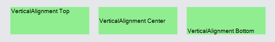
The TextBlock.VerticalAlignment property controls the vertical alignment of the glyphs within the bounds. Neither TextBlock.TextAlign nor TextBlock.VerticalAlignment affect the sizing of the TextBlock.
  diagram.Add(
    new Part("Horizontal")
      .Add(
        new TextBlock {
          Text = "VerticalAlignment Top", Background = "lightgreen", Margin = 10,
          Width = 170, Height = 60,
          VerticalAlignment = Spot.Top
        },
        new TextBlock {
          Text = "VerticalAlignment Center", Background = "lightgreen", Margin = 10,
          Width = 170, Height = 60,
          VerticalAlignment = Spot.Center
        },
        new TextBlock {
          Text = "VerticalAlignment Bottom", Background = "lightgreen", Margin = 10,
          Width = 170, Height = 60,
          VerticalAlignment = Spot.Bottom
        }
      )
  );
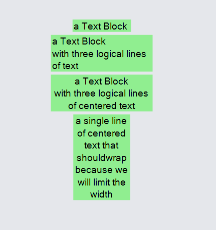
TextAlign and Multiline or Wrapping
The TextBlock.TextAlign property is useful even when the TextBlock has its natural size. This occurs when the text occupies multiple lines, whether by embedded newlines causing line breaks or by wrapping. You can control whether text starting with the first newline character is ignored by setting the TextBlock.IsMultiline. By default both multiline and wrapping are enabled.
  diagram.Add(
    new Part("Vertical")
      .Add(
        new TextBlock {
          Text = "a Text Block\nwith three logical lines\nof text",
          Background = "lightgreen", Margin = 2,
          IsMultiline = false
        },
        new TextBlock {
          Text = "a Text Block\nwith three logical lines\nof text",
          Background = "lightgreen", Margin = 2,
          IsMultiline= true
        },
        new TextBlock {
          Text = "a Text Block\nwith three logical lines\nof centered text",
          Background = "lightgreen", Margin = 2,
          IsMultiline = true, TextAlign = TextAlign.Center
        },
        new TextBlock {
          Text = "a single line of centered text that should" +
            "wrap because we will limit the width",
          Background = "lightgreen", Margin = 2, Width = 80,
          Wrap = Wrap.Fit, TextAlign = TextAlign.Center
        }
      )
  );
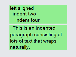
Indenting
Each line of text is normally trimmed of leading and trailing spaces before rendering.
If you wish to indent a line of text by preserving leading spaces, start the line with the
zero-width space character: \u200B.
Wikipedia: Zero-width space
  diagram.Add(
    new Part("Vertical")
      .Add(
        new TextBlock {
          Text = "left aligned\n\u200B  indent two\n\u200B    indent four",
          Background = "lightgreen", Margin = 2, Width = 150
        },
        new TextBlock {
          Text = "\u200B  This is an indented paragraph consisting of lots of text that wraps naturally.",
          Background = "lightgreen", Margin = 2, Width = 150
        }
      )
  );
You can also use a \u200B character if you want to preserve spaces at the end of a line.
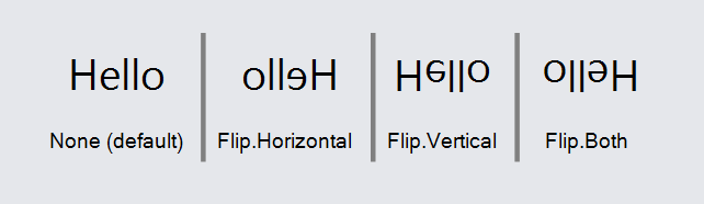
Flipping
You can flip text horizontally and vertically with the TextBlock.Flip property:
  diagram.Add(
    new Part("Table") {
        DefaultColumnSeparatorStrokeWidth = 3,
        DefaultColumnSeparatorStroke = "gray",
        DefaultSeparatorPadding = 5
      }
      .Add(
        new TextBlock {
          Text = "Hello", Column = 0, Margin = 2, Font = new Font("Segoe UI", 26),
          Flip = Flip.None
        },
        new TextBlock { Text = "None (default)", Row = 1, Column = 0 },
        new TextBlock {
          Text = "Hello", Column = 1, Margin = 2, Font = new Font("Segoe UI", 26),
          Flip = Flip.Horizontal
        },
        new TextBlock { Text = "Flip.Horizontal", Row = 1, Column = 1 },
        new TextBlock {
          Text = "Hello", Column = 2, Margin = 2, Font = new Font("Segoe UI", 26),
          Flip = Flip.Vertical
        },
        new TextBlock { Text = "Flip.Vertical", Row = 1, Column = 2 },
        new TextBlock {
          Text = "Hello", Column = 3, Margin = 2, Font = new Font("Segoe UI", 26),
          Flip = Flip.Both
        },
        new TextBlock { Text = "Flip.Both", Row = 1, Column = 3 }
      )
  );
Editing
GoDiagram also supports the in-place editing of text by the user. You just need to set the TextBlock.Editable property to true.
If you want to provide text validation of the user's input, you can set the TextBlock.TextValidation property to a function. You can also provide a more customized or sophisticated text editor by setting the TextBlock.TextEditor property. There is an example of text validation on the Validation intro page.
  diagram.Add(
    new Part()
      .Add(
        new TextBlock {
          Text = "select and then click to edit",
          Background = "lightblue",
          Editable = true, IsMultiline = false
        }
      )
  );
  diagram.Add(
    new Part()
      .Add(
        new TextBlock {
          Text = "this one allows embedded newlines",
          Background = "lightblue",
          Editable = true
        }
      )
  );